Nooly
A strategic identity and packaging system for a modern syrup brand, balancing better for you benefits with stronger emotional appeal and a more distinctive market presence.


Overview
Nooly was envisioned as a more relevant kind of syrup brand for a category still dominated by products that feel overly sweet, visually predictable, and out of step with contemporary preferences. The ambition was to create a brand that could deliver the indulgence people expect, while introducing cleaner ingredients, reduced sugar, and a more thoughtful point of view.
Designed for coffee lovers, home baristas, wellness minded consumers, and modern families, Nooly set out to make everyday rituals feel more elevated and more intentional. The opportunity was not simply to make syrup look better. It was to reposition the category through a brand that feels fresher, more expressive, and more aligned with how people want to consume now.
Challenge
The challenge was to build a brand that could hold two expectations at once. Nooly needed to communicate low sugar, prebiotic support, and natural ingredients with clarity, while avoiding the clinical cues that often make better for you products feel medicinal or emotionally flat.
At the same time, the category demanded stronger distinctiveness. The brand needed enough personality to stand apart, while still feeling credible, easy to navigate, and commercially convincing across shelf, café, and digital environments.
Solution
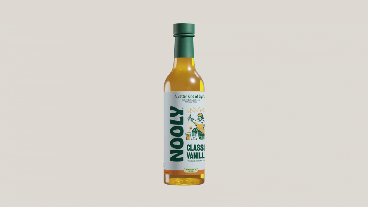
Widarto Impact developed a strategic identity and packaging system designed to make better for you values feel more inviting, more expressive, and more desirable in market.
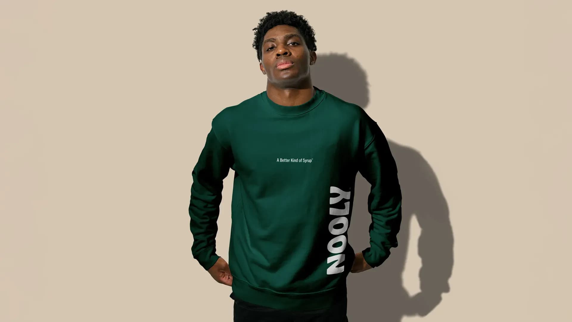
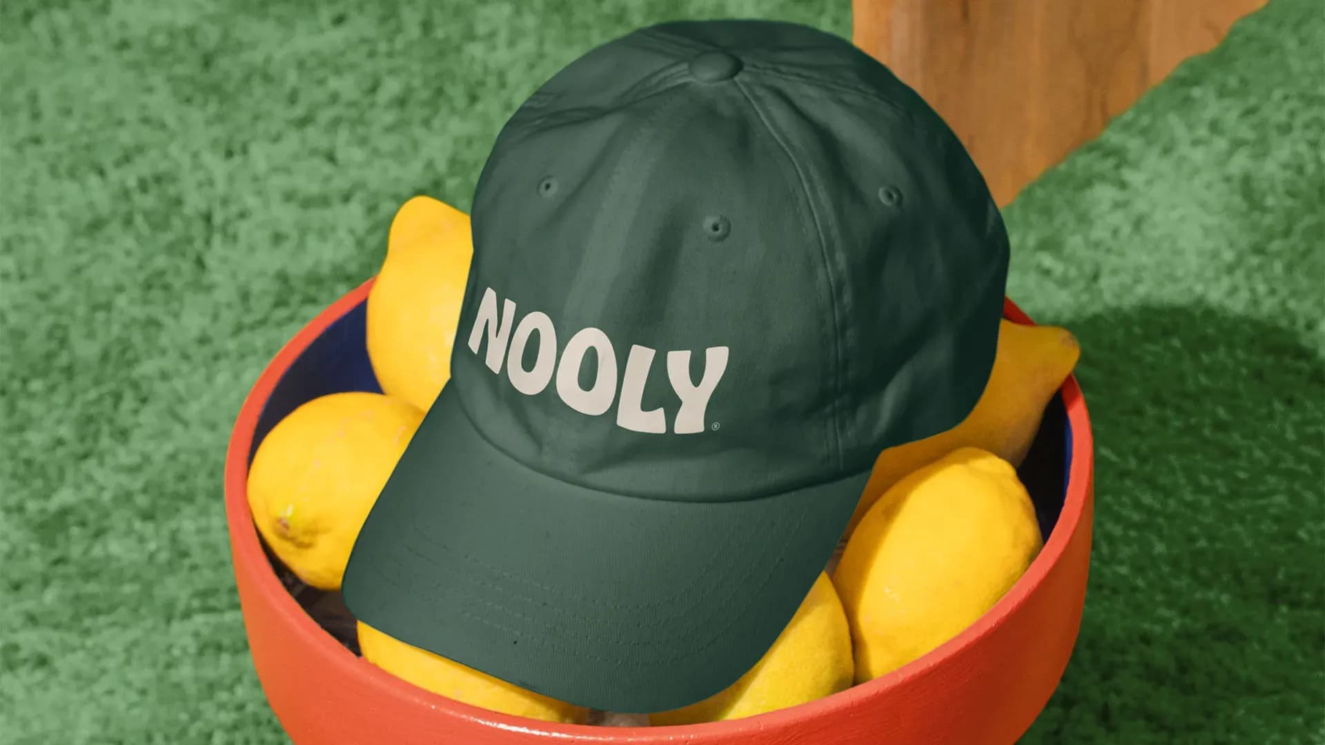
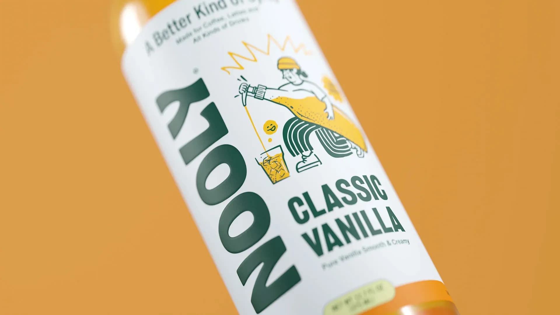
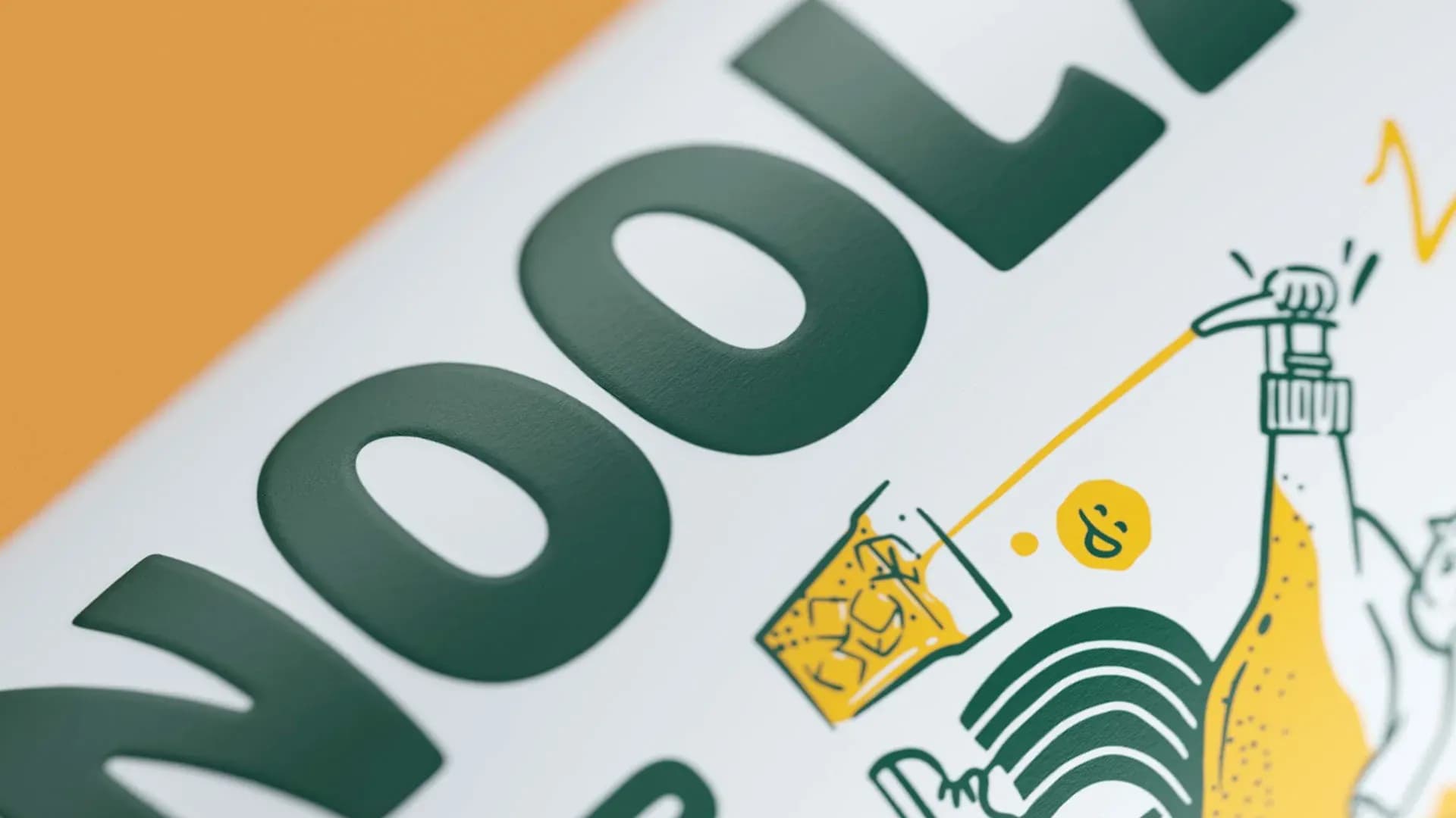
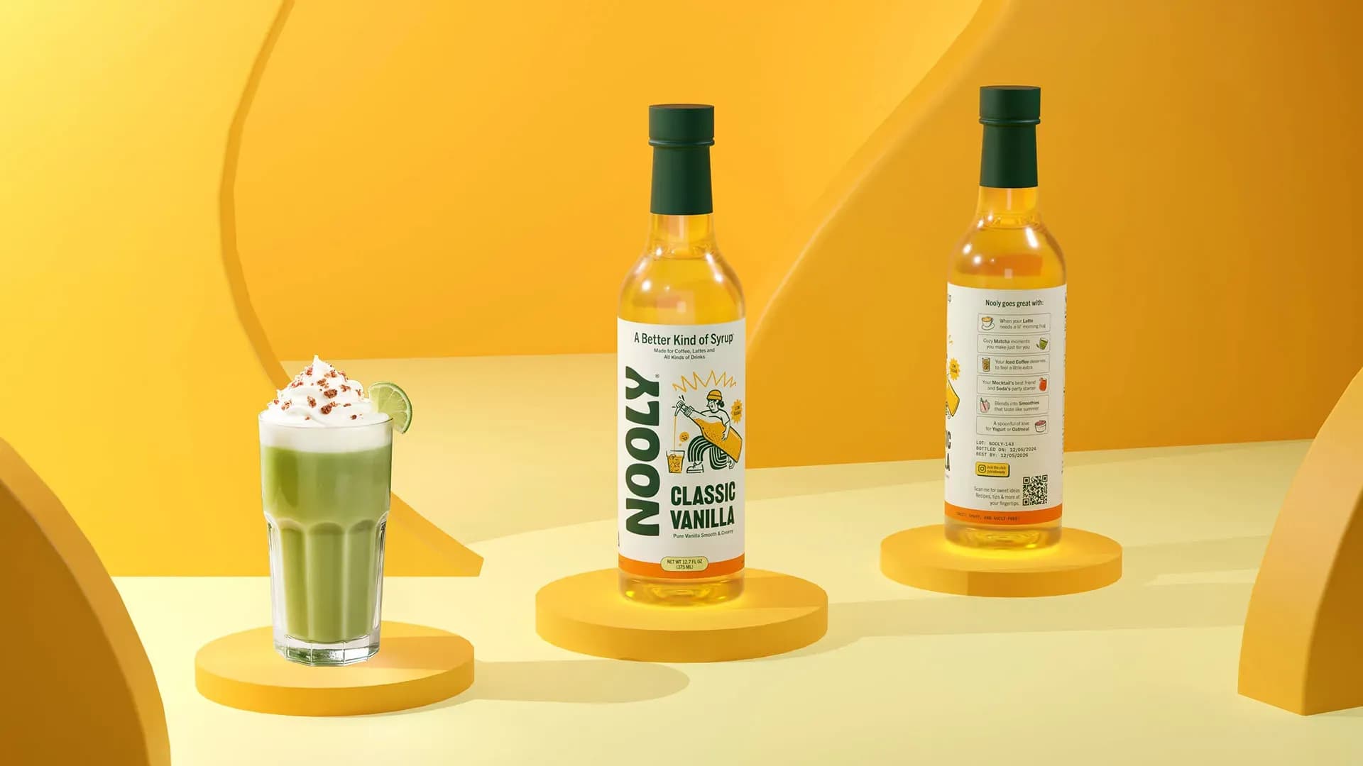
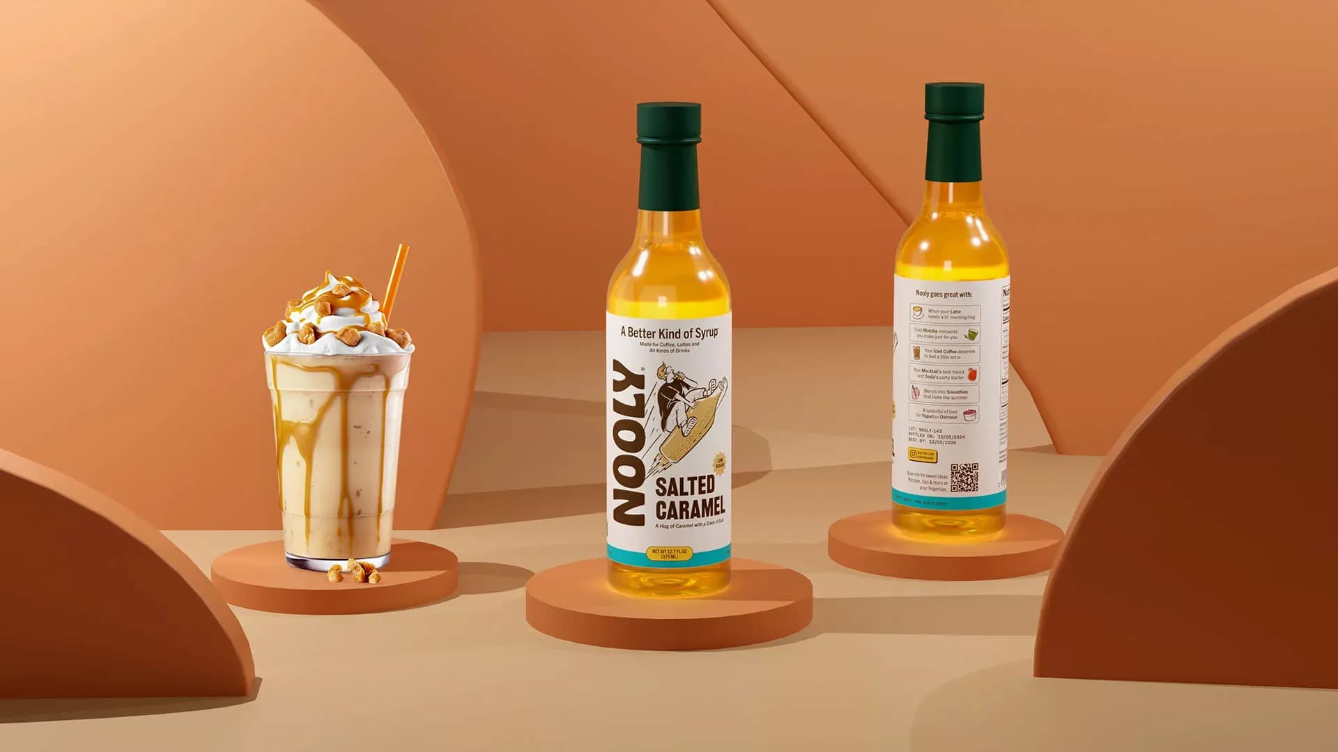
The brand needed to move away from the overly functional codes often seen in health led products, so the identity was built to feel warmer, more characterful, and more emotionally engaging from the outset. The logotype brought together retro charm and contemporary confidence, helping Nooly feel playful and distinctive while still holding enough clarity and presence to perform consistently across shelf and digital applications.
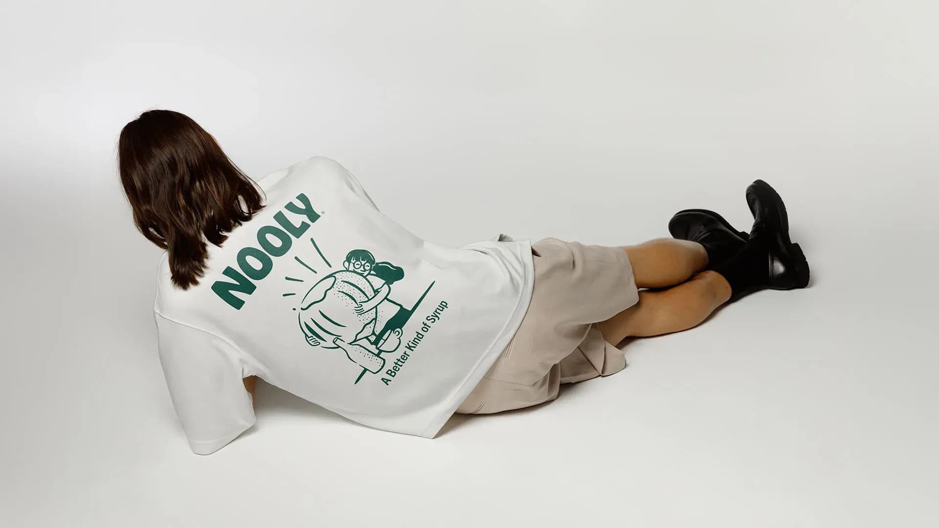
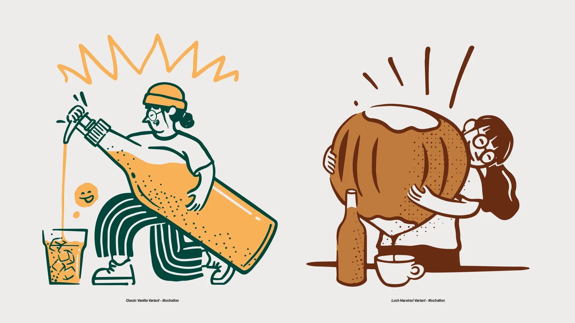
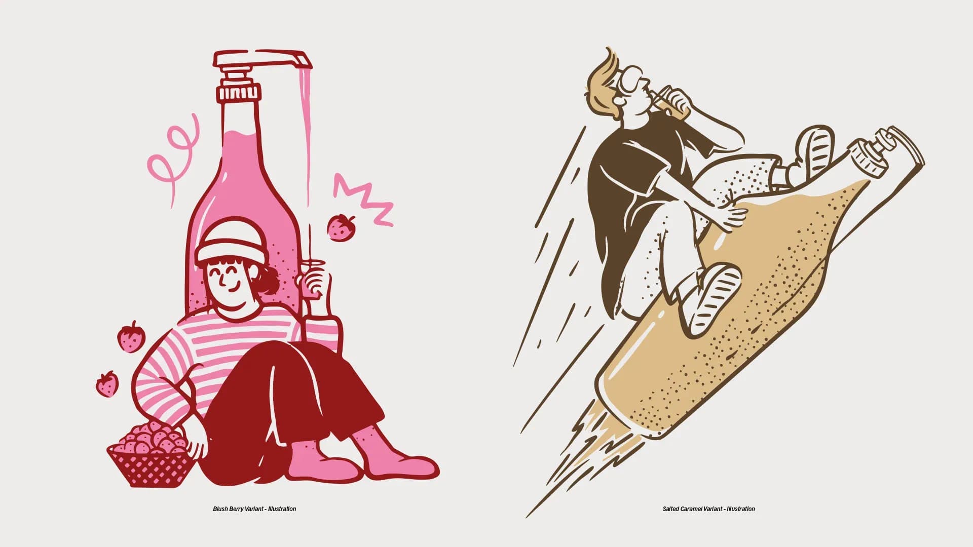
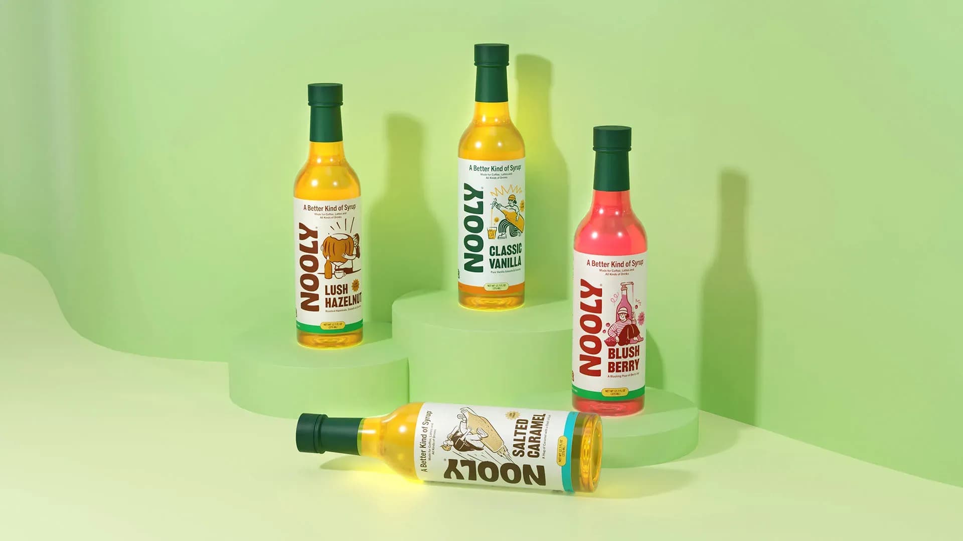
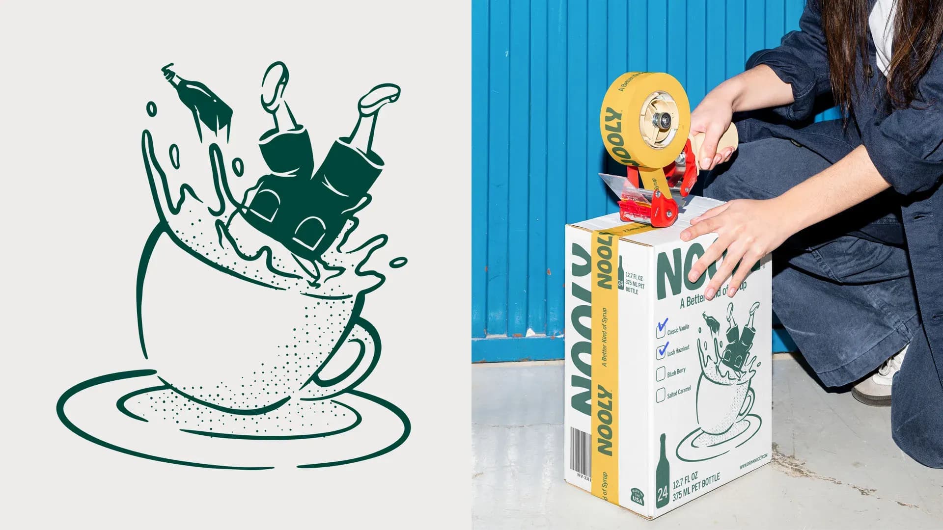
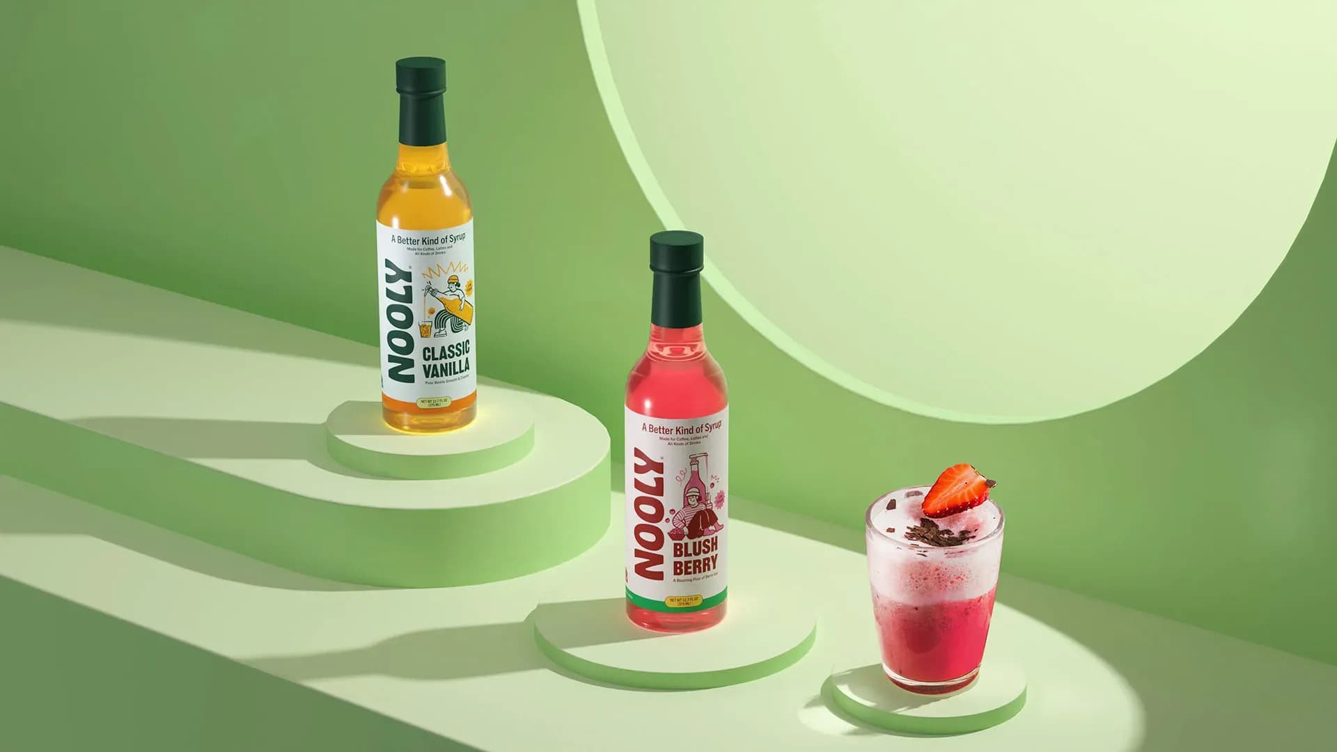
To avoid a generic lifestyle look, a doodle comic hybrid illustration approach was introduced for each variant. This gave the brand a more ownable visual language, strengthened flavour personality, and created a system that could carry storytelling more naturally across packaging and communication. Colour was then used not just for appetite appeal, but as a navigational tool, helping consumers differentiate flavours quickly while reinforcing cohesion across the range.
The line A Better Kind of Syrup anchored the brand with a promise that connected functional value to emotional appeal. Together with a clear typographic hierarchy, the system was designed to make the brand feel easier to understand, more memorable to encounter, and more desirable to choose.
What took shape was a syrup brand built for modern expectations. One that feels more expressive than functional wellness brands, more credible than novelty led competitors, and better equipped to make healthier indulgence feel genuinely desirable.
Client
Nooly
Industry
Food & Drink
Services
Brand Identity Packaging Design Illustration
Team
Eko Widarto
Dwiken Maulana
Besta Ramadhan


