Body Restore
Reimagining a fast growing wellness brand through a scalable packaging system that brings greater clarity, stronger recognition, and a more cohesive foundation for expansion.

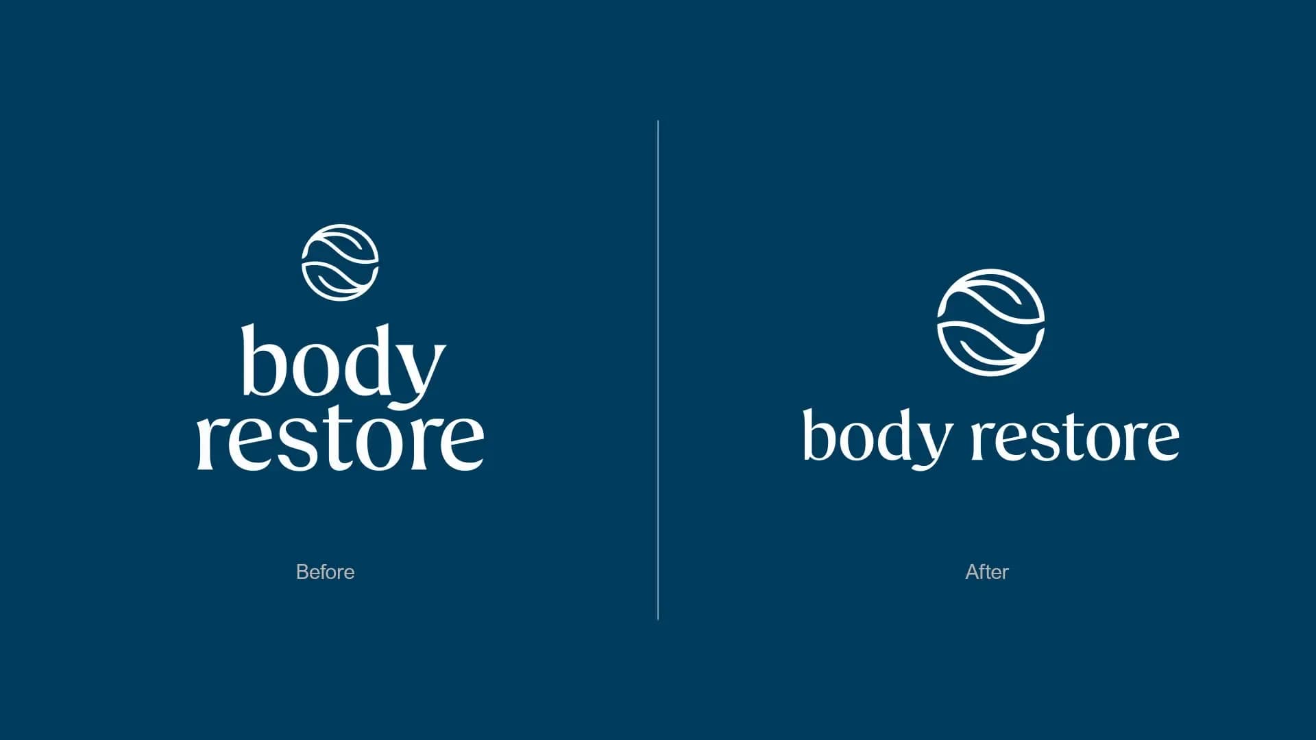
“A refined logo system that improves readability, strengthens balance, and elevates the Body Restore symbol from a decorative element into a more iconic and recognisable brand signature.”


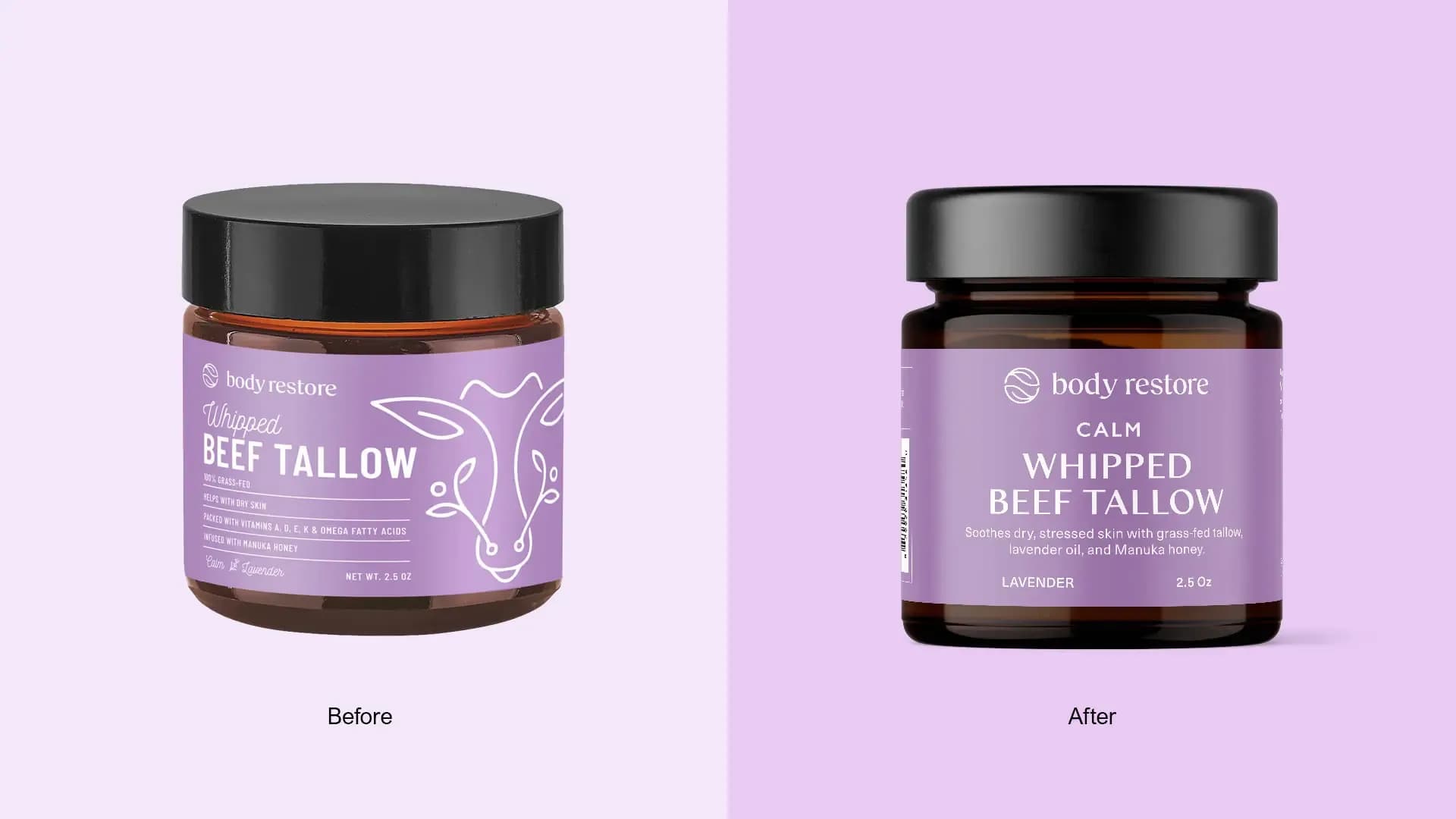
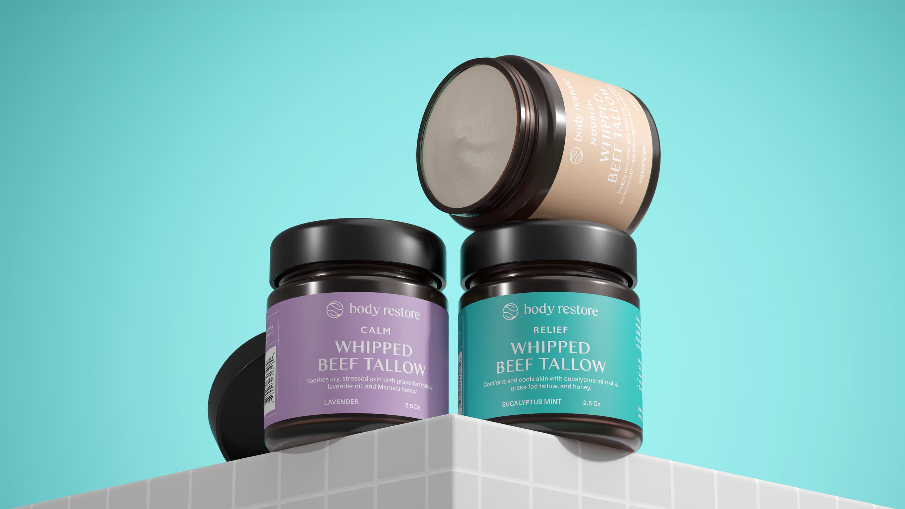
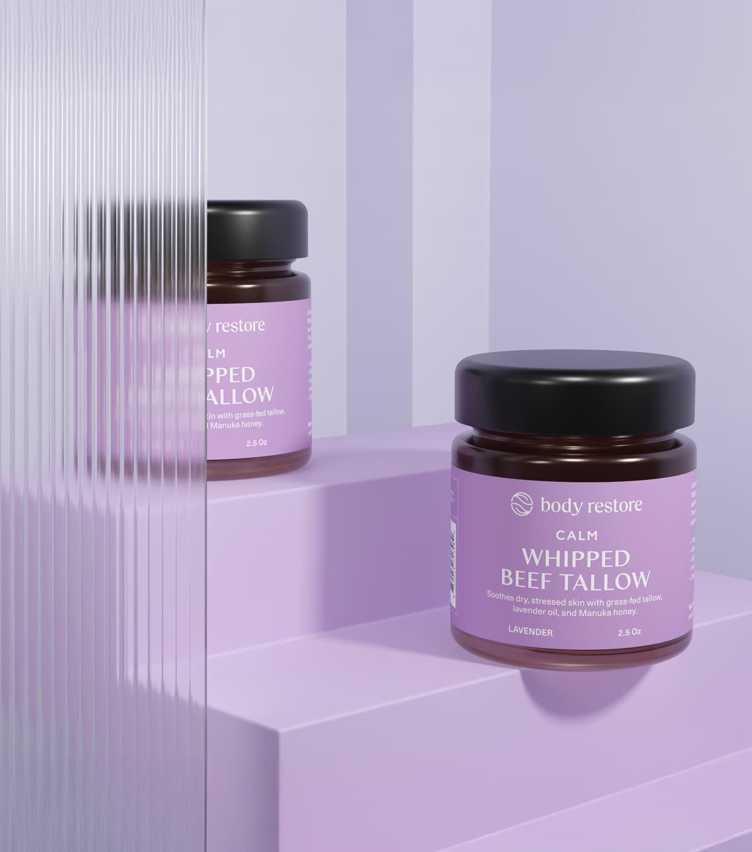
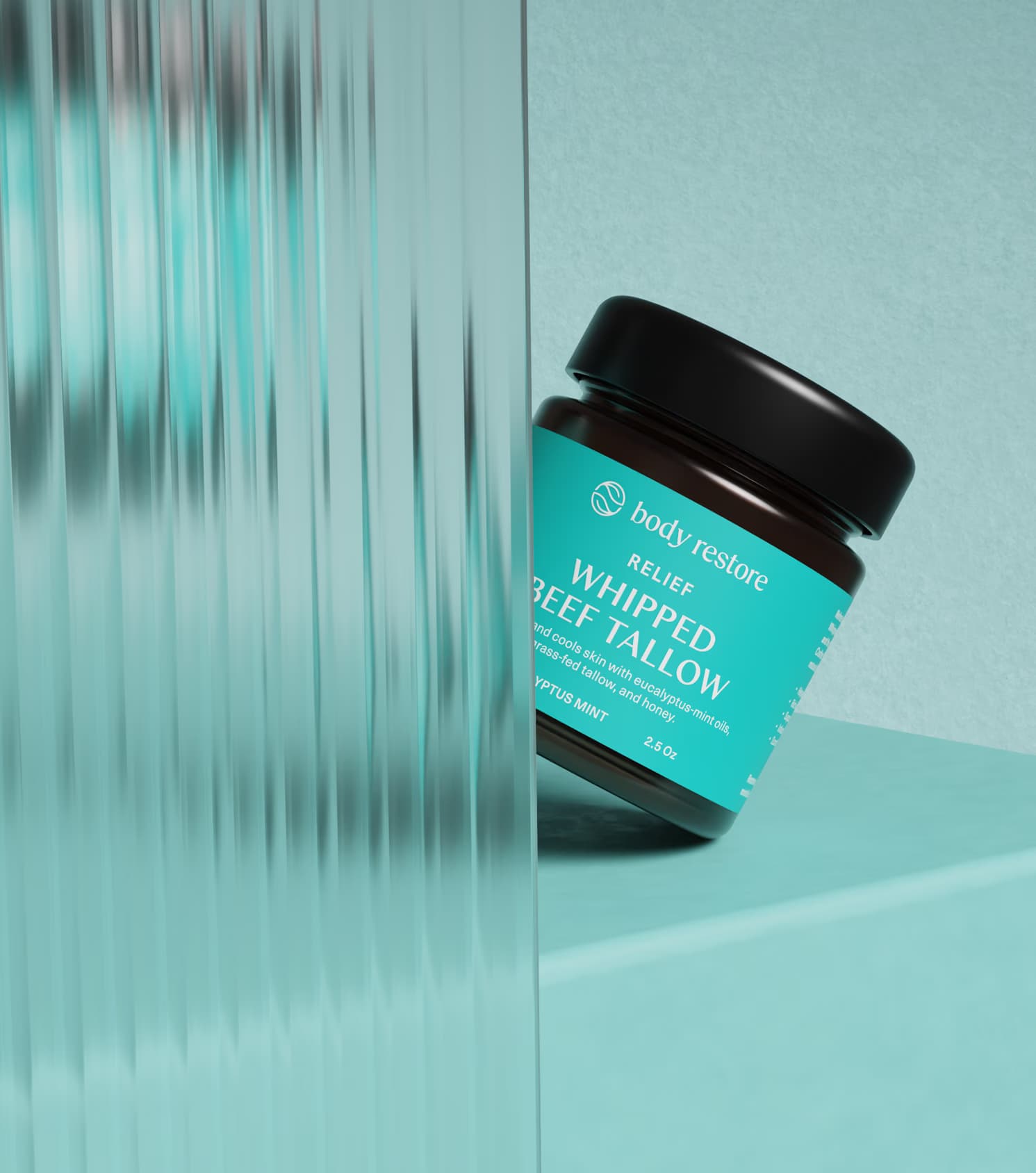
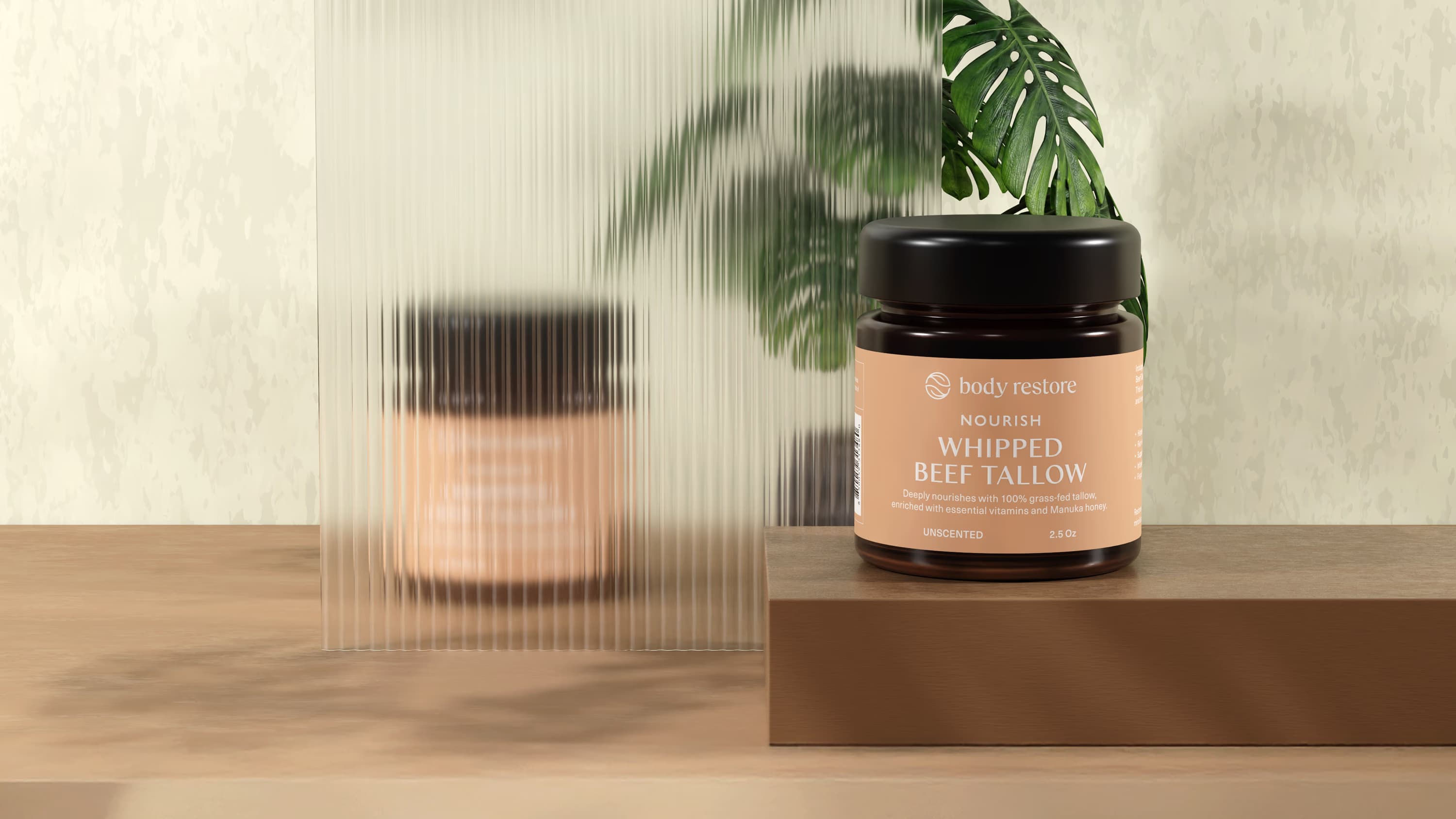
“Redesigned to replace visual clutter with clearer hierarchy, more evocative colour, and a more ownable visual language built for stronger recognition and shelf impact.”


"Reframed from a visually busy label into a more disciplined brand expression, using hierarchy, colour, and restraint to create stronger recognition, higher perceived value, and a more credible premium presence in market."

Overview
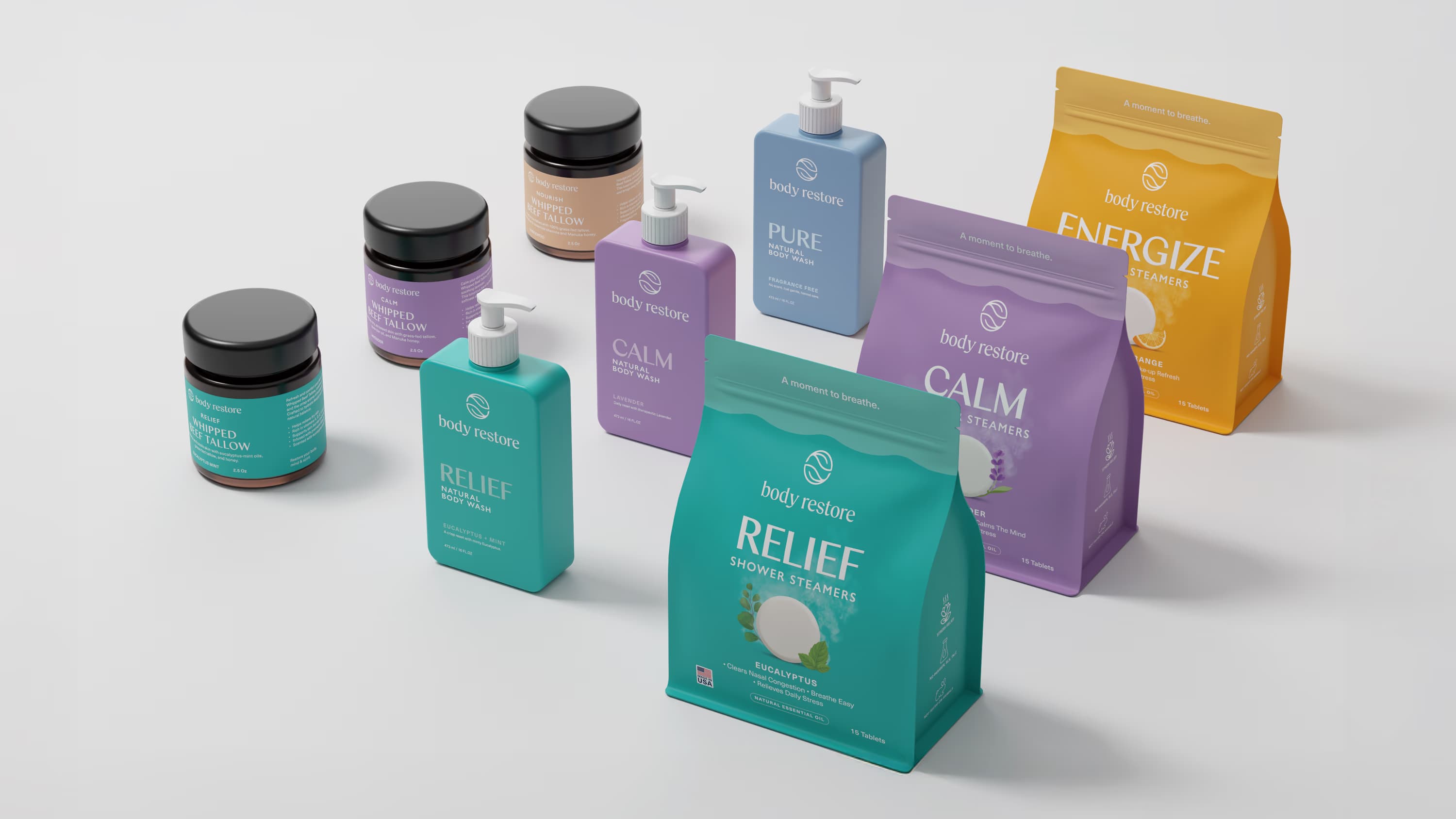
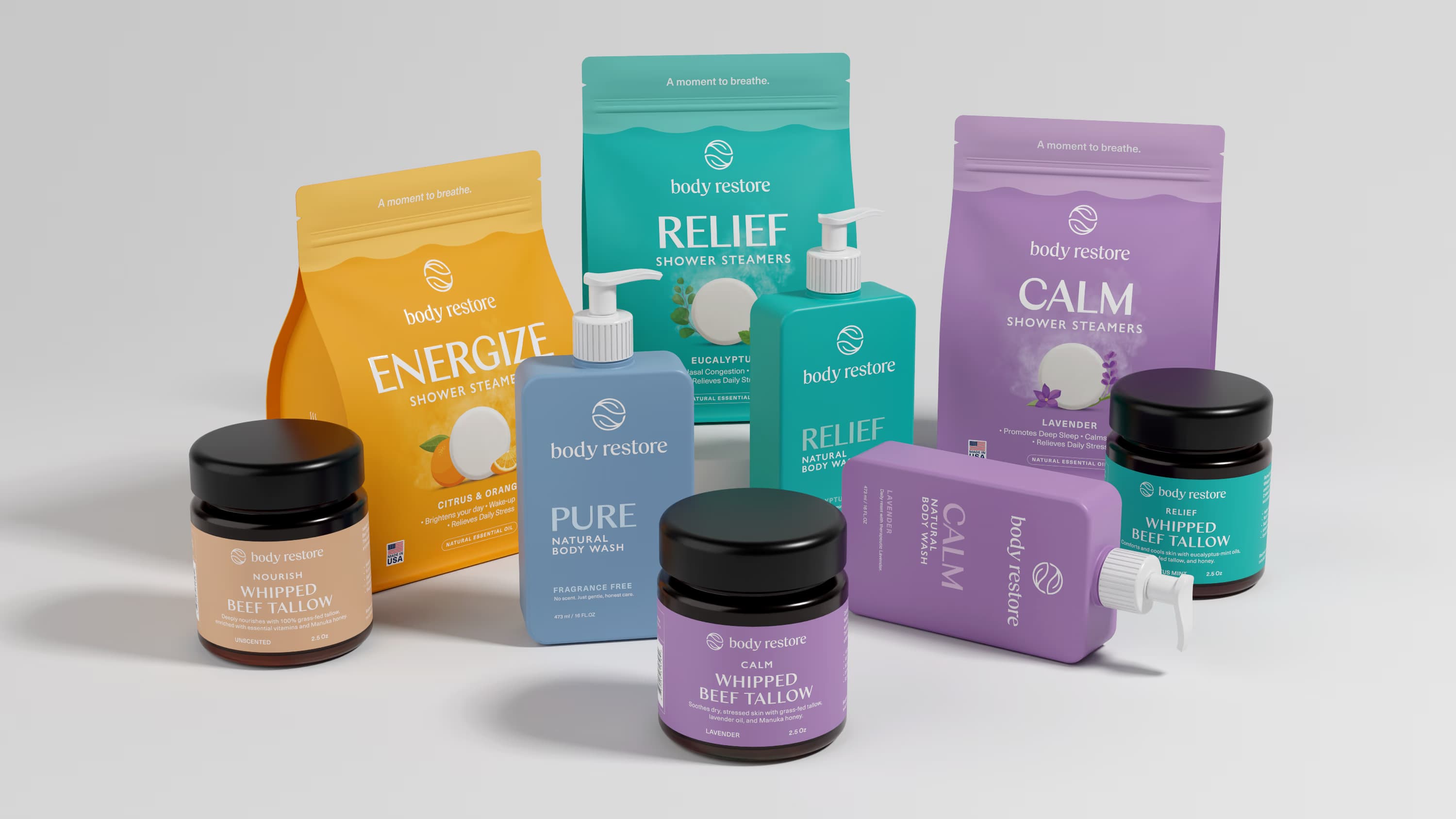
Body Restore is a best selling wellness brand on Amazon, trusted by thousands for its aromatherapeutic Shower Steamers and natural body care essentials. As the brand gained momentum and expanded into new categories, the opportunity was no longer simply about adding more products. It became about building a more cohesive brand world that could support growth with greater clarity, consistency, and confidence.
Challenge
As Body Restore moved beyond its core Shower Steamers into categories such as Steam Eye Masks, Lotion, and future personal care lines, the packaging began to lose cohesion. Each SKU felt increasingly disconnected, making it harder for the brand to build a unified presence, strengthen recognition across the portfolio, and support long term equity as the range continued to grow.
The challenge was not only to improve how the packaging looked, but to create a more scalable system that could bring structure to the expanding portfolio while preserving the emotional and functional cues customers had already come to trust.
Solution
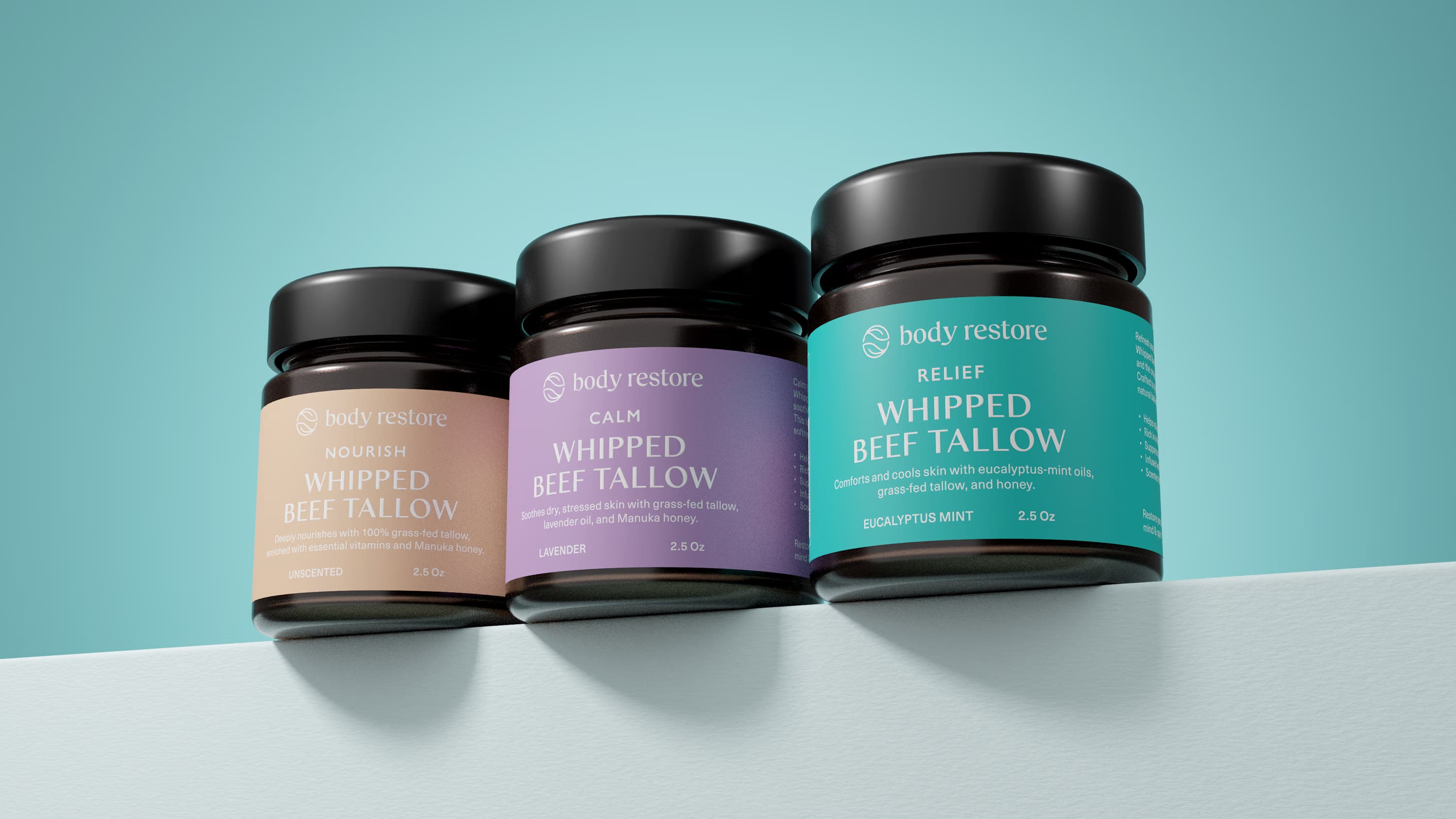
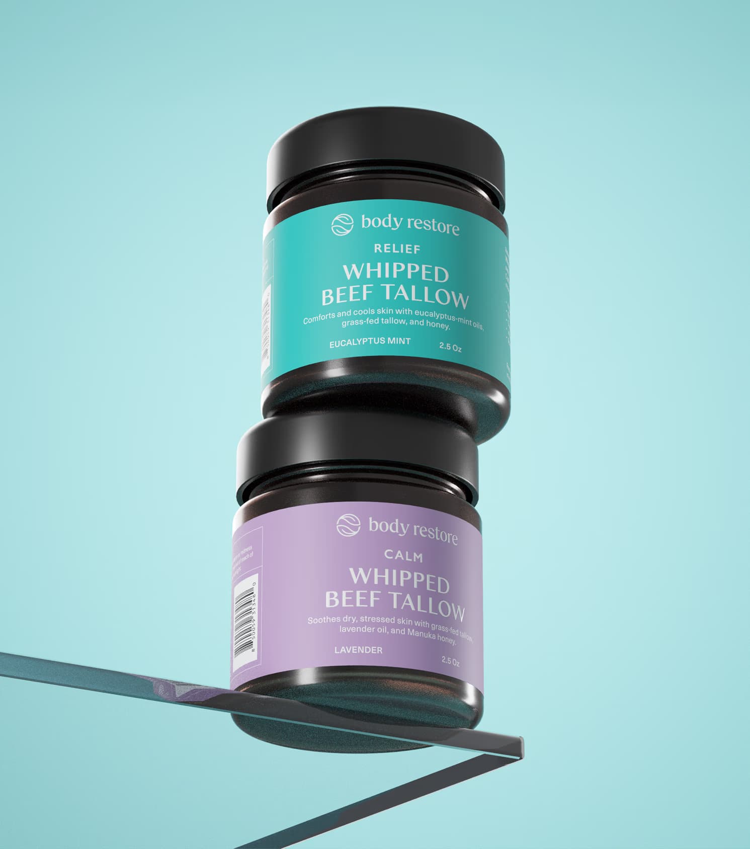
Widarto Impact developed a scalable packaging system designed to bring greater unity, clarity, and flexibility across the growing portfolio.
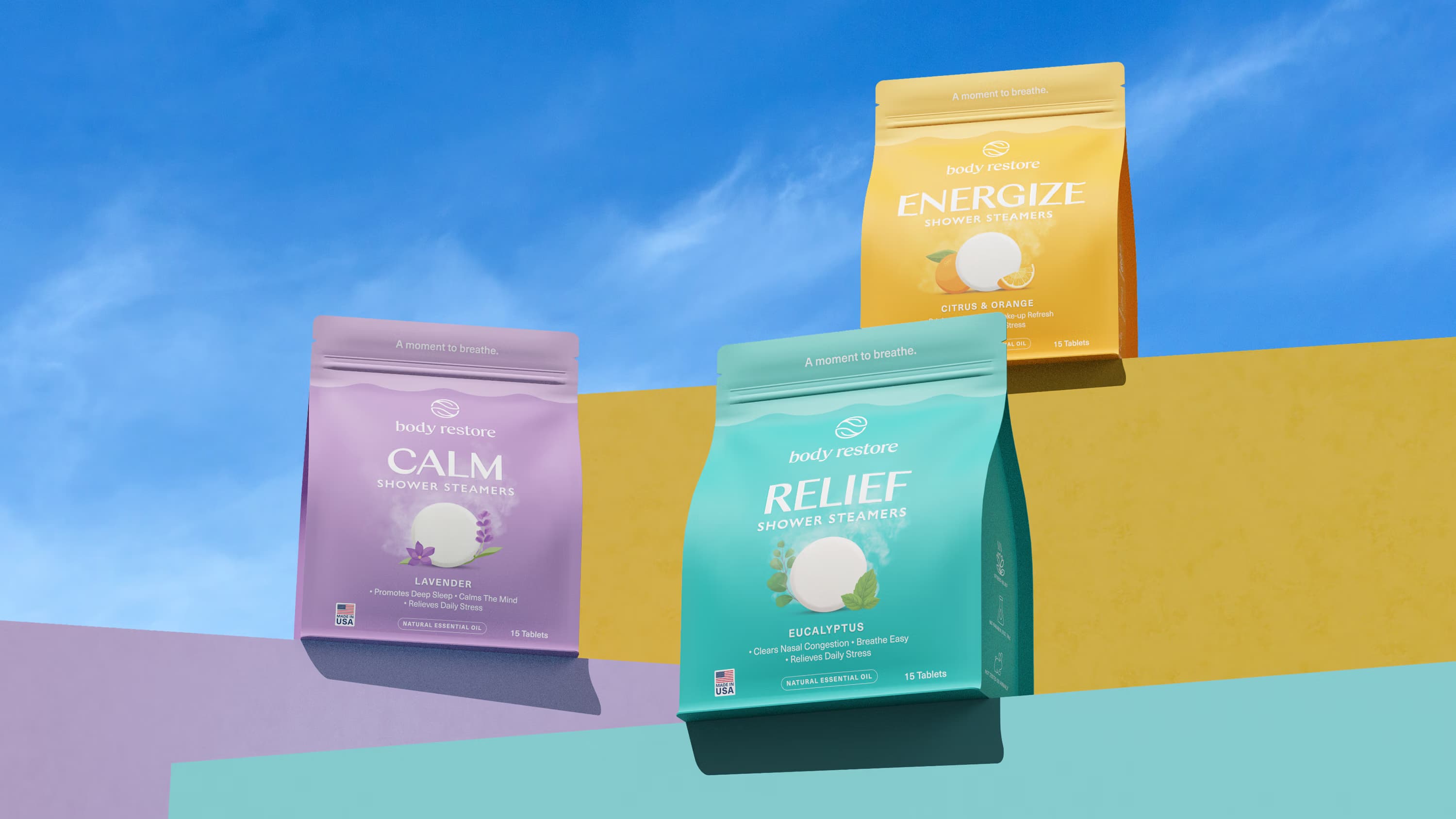
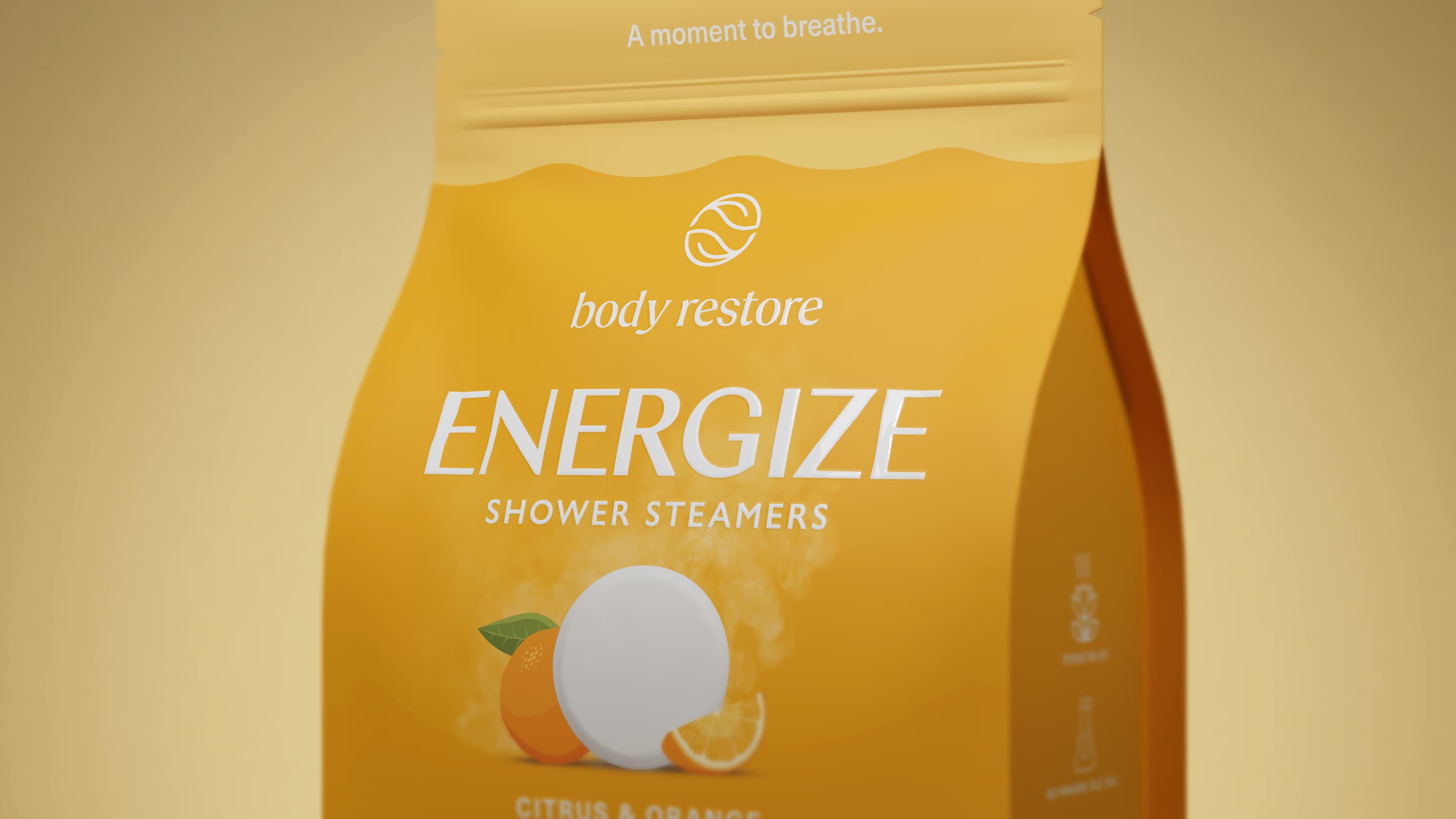
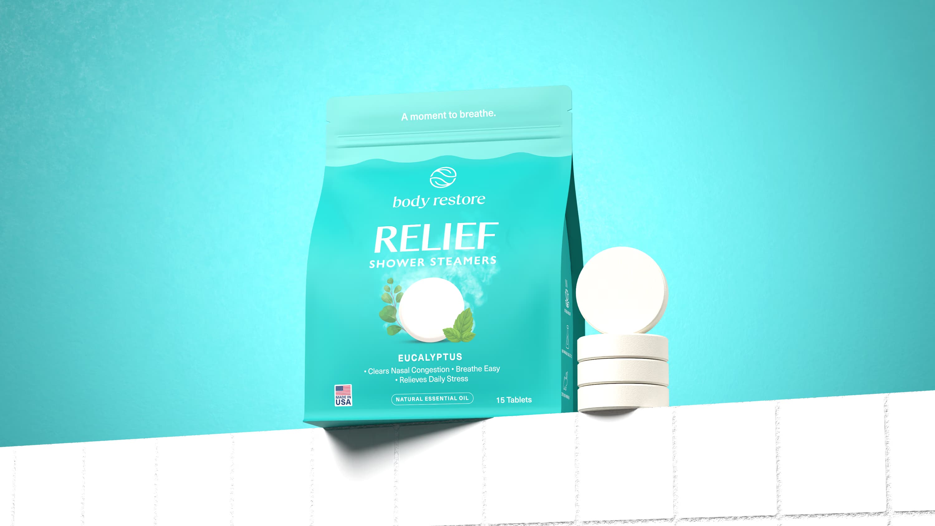
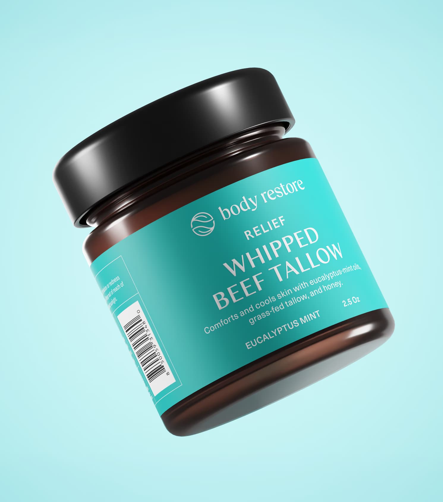
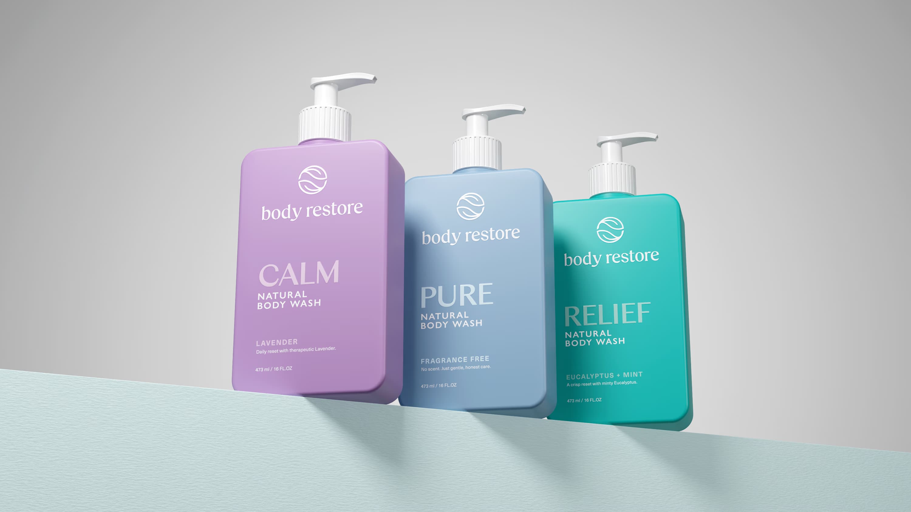
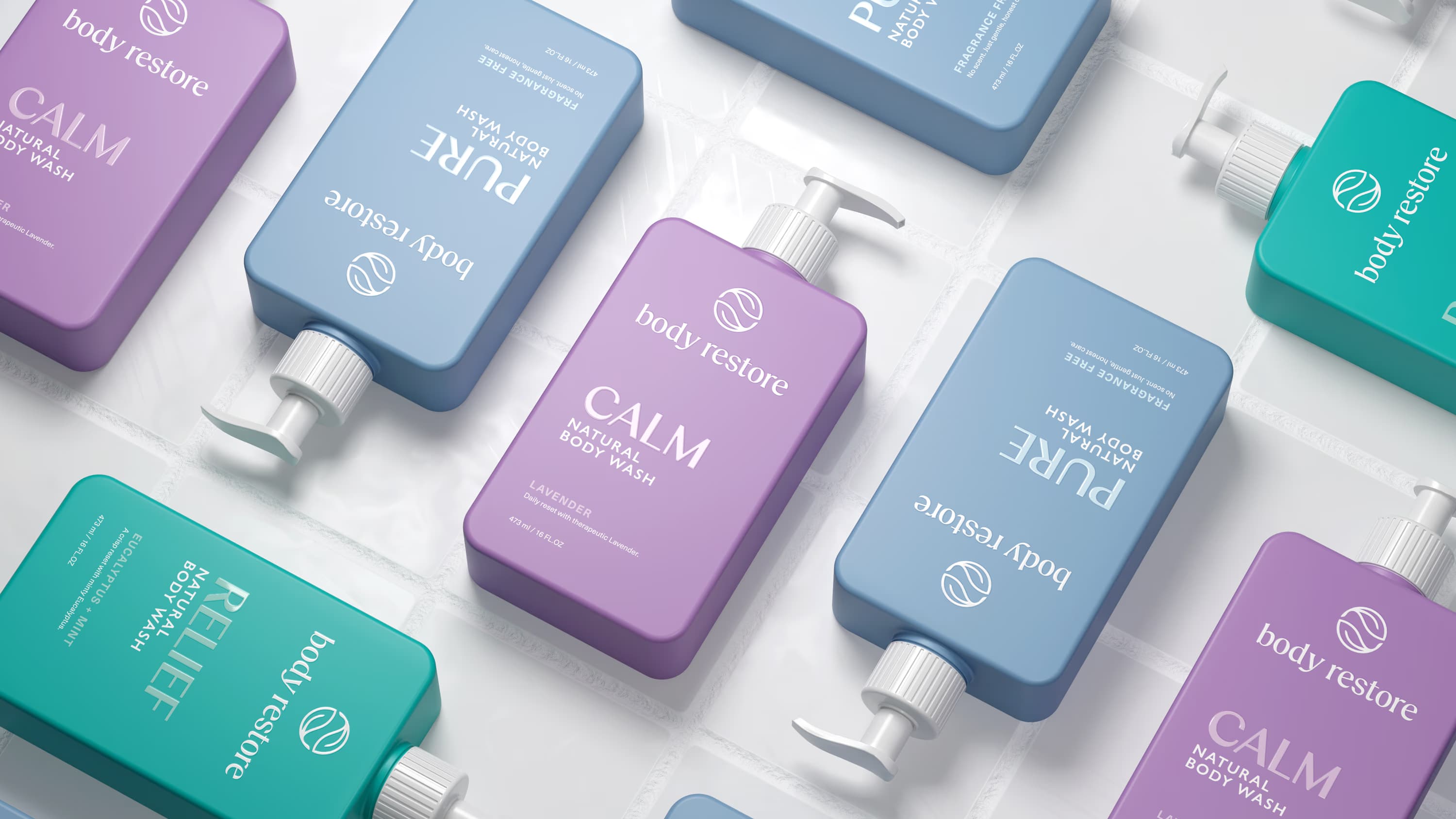
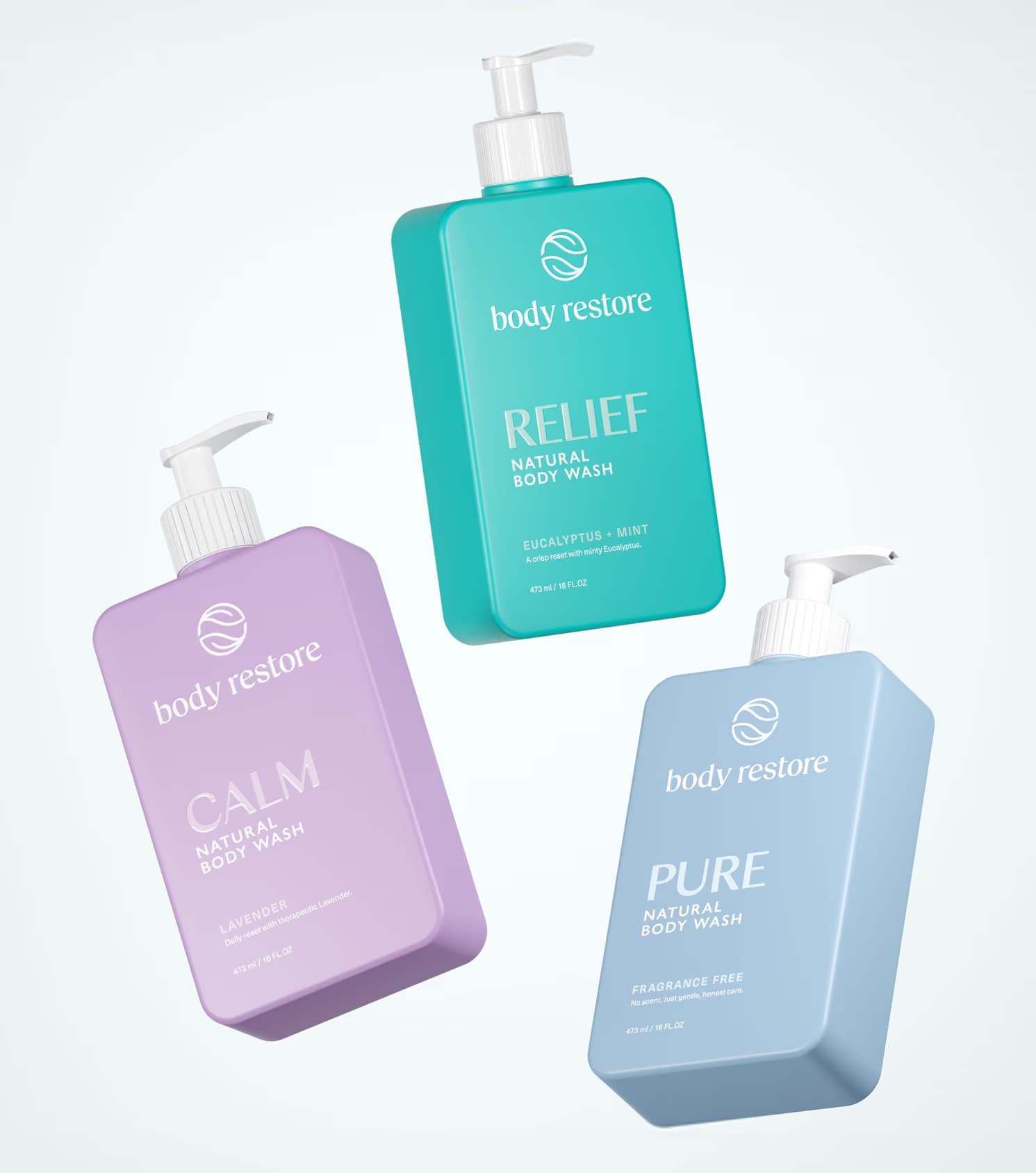
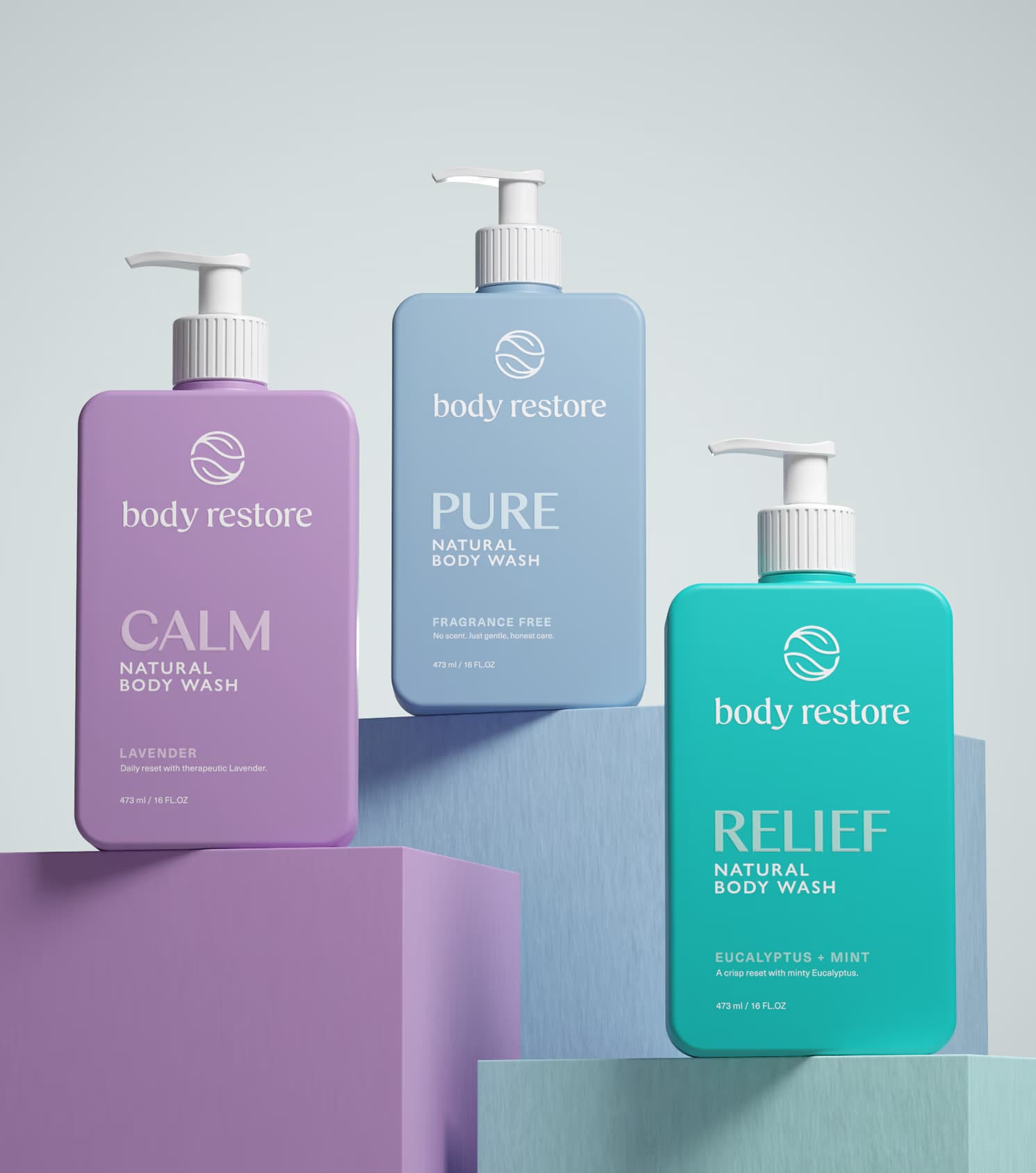
Built around the idea A Moment to Breathe, the new direction repositioned Body Restore not simply as a functional wellness product, but as a calming sensory ritual within everyday life. We refined the logo to improve its balance, confidence, and presence within the system, then restructured the packaging architecture with a clearer hierarchy across product name, variant, and benefit to create stronger consistency and easier navigation across categories.
To preserve familiarity while elevating the brand, Columbia Sans was retained and paired with Neue Haas Unica to establish a more controlled and legible typographic framework. A scent led colour strategy was introduced to improve range recognition while giving each variant a clearer and more intuitive identity. We also redefined the visual language of the core Shower Steamers line by moving away from overused generic category symbols and introducing a more ownable approach through the real tablet form combined with aroma specific botanical cues.
What emerged was a cleaner, more distinctive, and more expandable brand world. One that strengthens recognition, supports future line extensions, and allows Body Restore to grow with greater consistency and confidence.
Client
Body Restore
Industry
Wellness
Services
Packaging Redesign Brand System Wellness


