Piccolo Coffee Roasters
A packaging system for a specialty coffee roastery, designed to bring greater distinction, stronger origin storytelling, and a more ownable shelf presence to the brand.
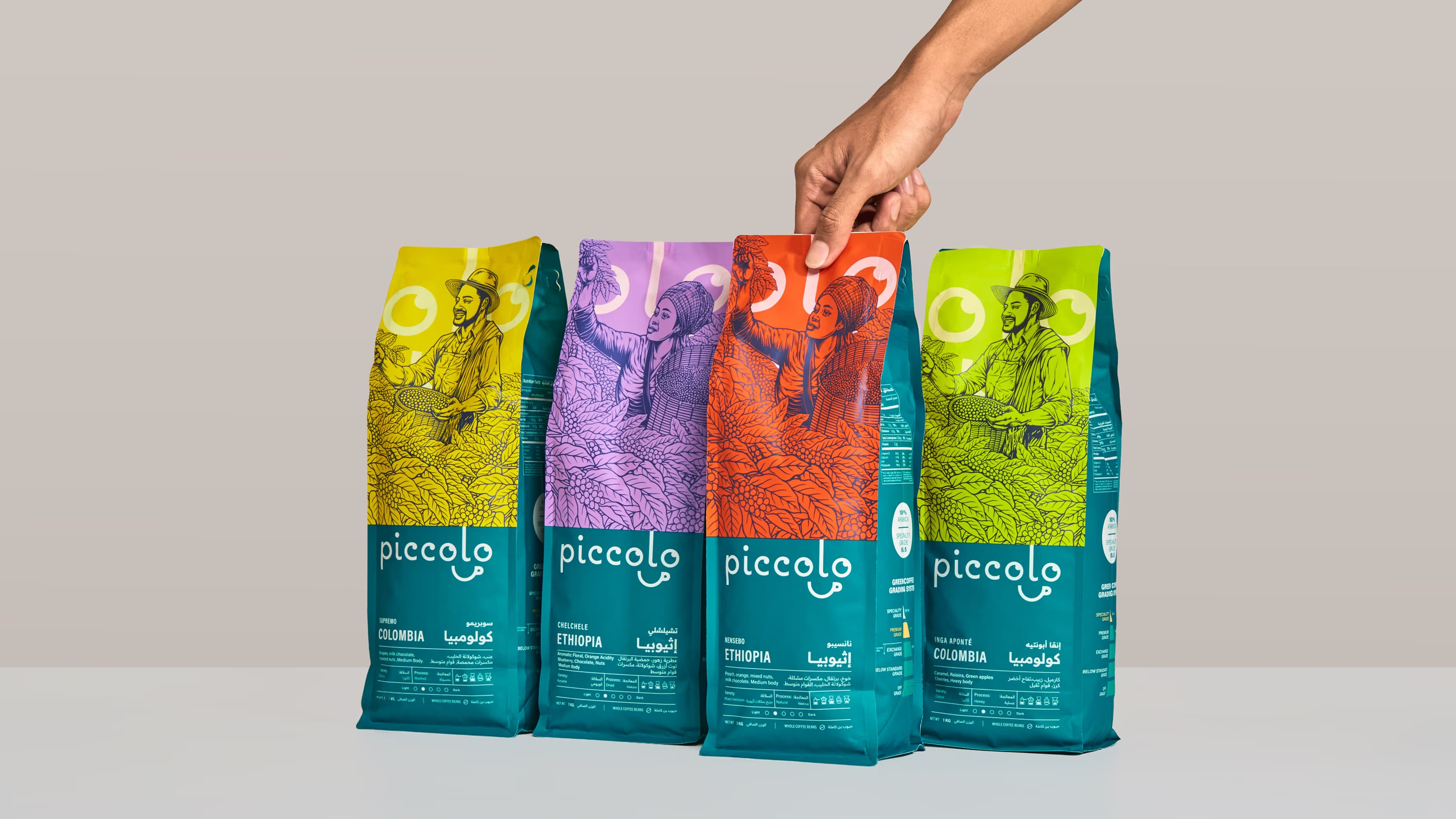
"A handcrafted illustration style was chosen to give Piccolo a more ownable way to express origin, people, and process, turning each pack into a more human, culturally grounded, and memorable expression of the journey behind the cup."
"A packaging system designed to make Piccolo feel more distinctive, more collectible, and more alive in the hands of consumers, turning each origin into a stronger expression of story, craft, and shelf appeal."
Overview
Piccolo Coffee Roastery is a Riyadh based coffee brand shaped by a deeper respect for coffee, not only as a drink, but as a journey of origin, craft, and human touch. As the brand evolved, the opportunity was not simply to make the packaging look more attractive. It was to build a more distinctive expression of Piccolo itself, one capable of carrying the richness of its coffee stories, strengthening recognition across the range, and giving the brand a more ownable presence in market.
Challenge
Coffee packaging often falls into familiar visual codes: muted palettes, expected craft cues, and generic origin storytelling. For Piccolo, that was not enough. The brand needed a system that could communicate quality and provenance with greater depth, while also expressing the people, places, and culture behind each coffee in a way that felt richer and more memorable.
The challenge was to create packaging that felt premium without becoming cold, expressive without becoming cluttered, and story led without losing clarity. It also needed to differentiate multiple origins clearly, work confidently across bilingual English and Arabic communication, and avoid the visual sameness that makes so much of the category feel interchangeable.
Solution
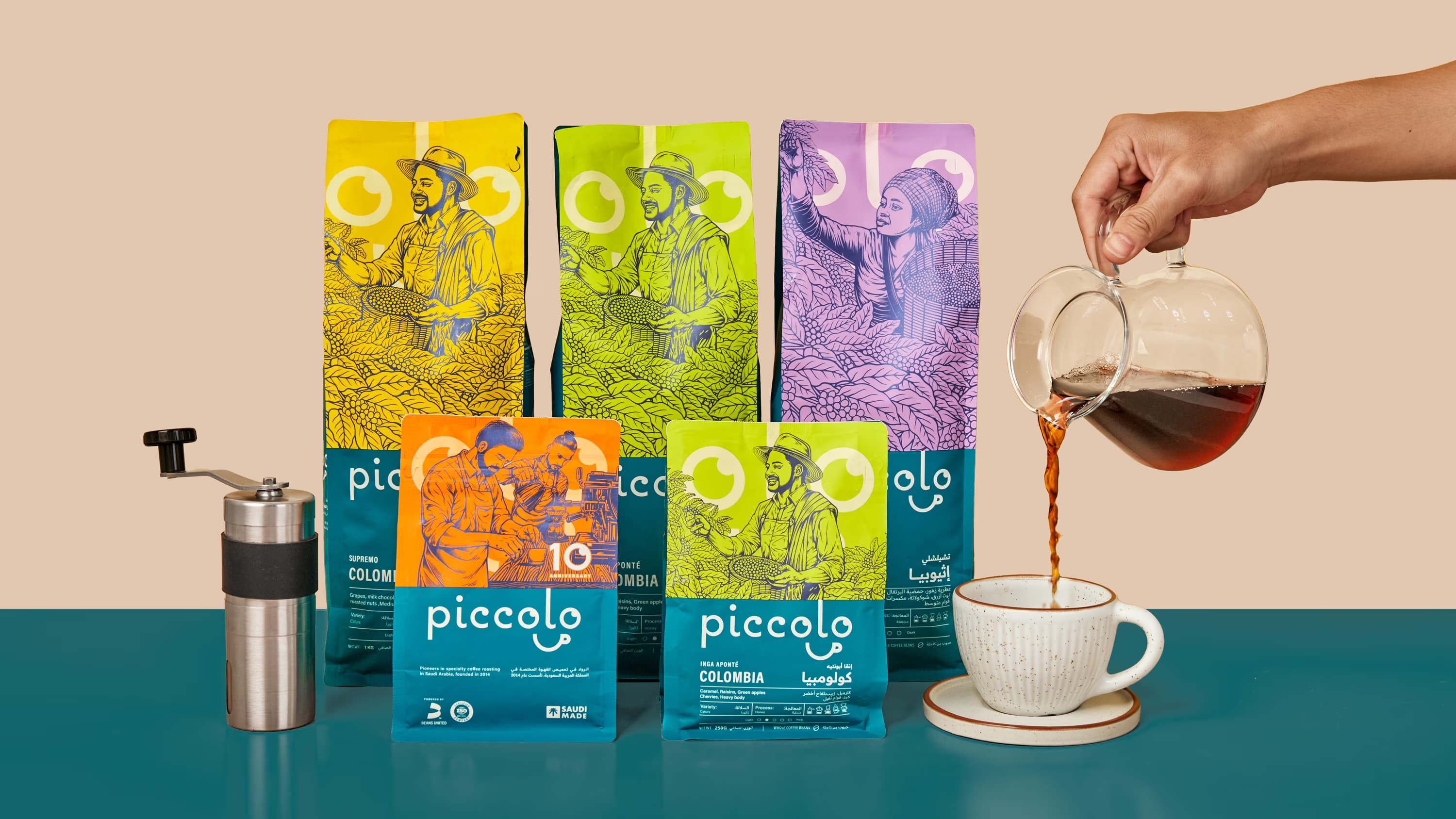
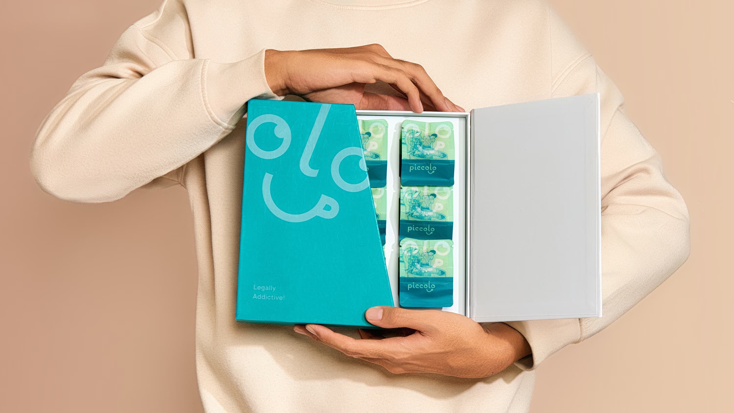
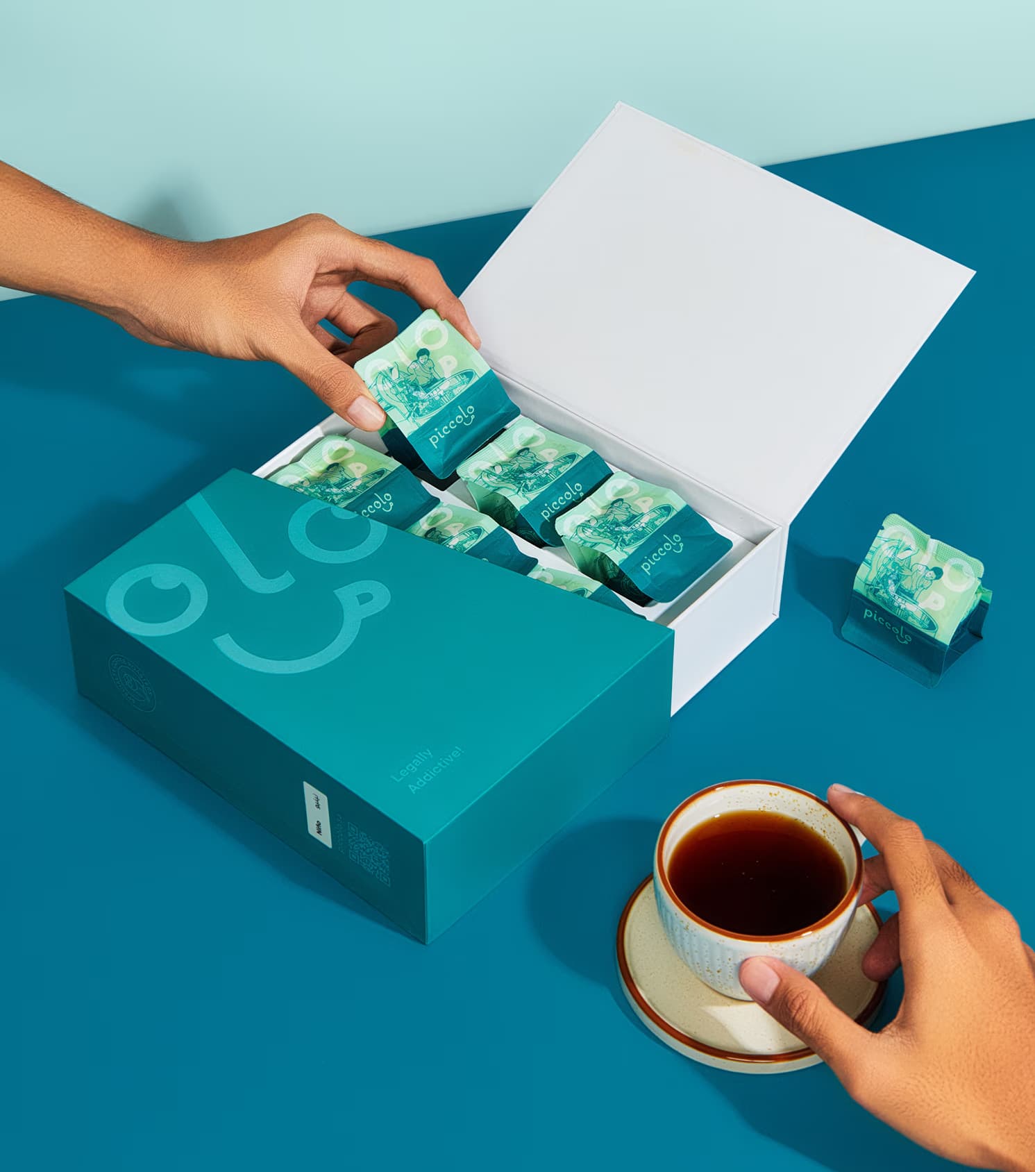
Widarto Impact developed a packaging system designed to give Piccolo a more vivid and distinctive voice on shelf.
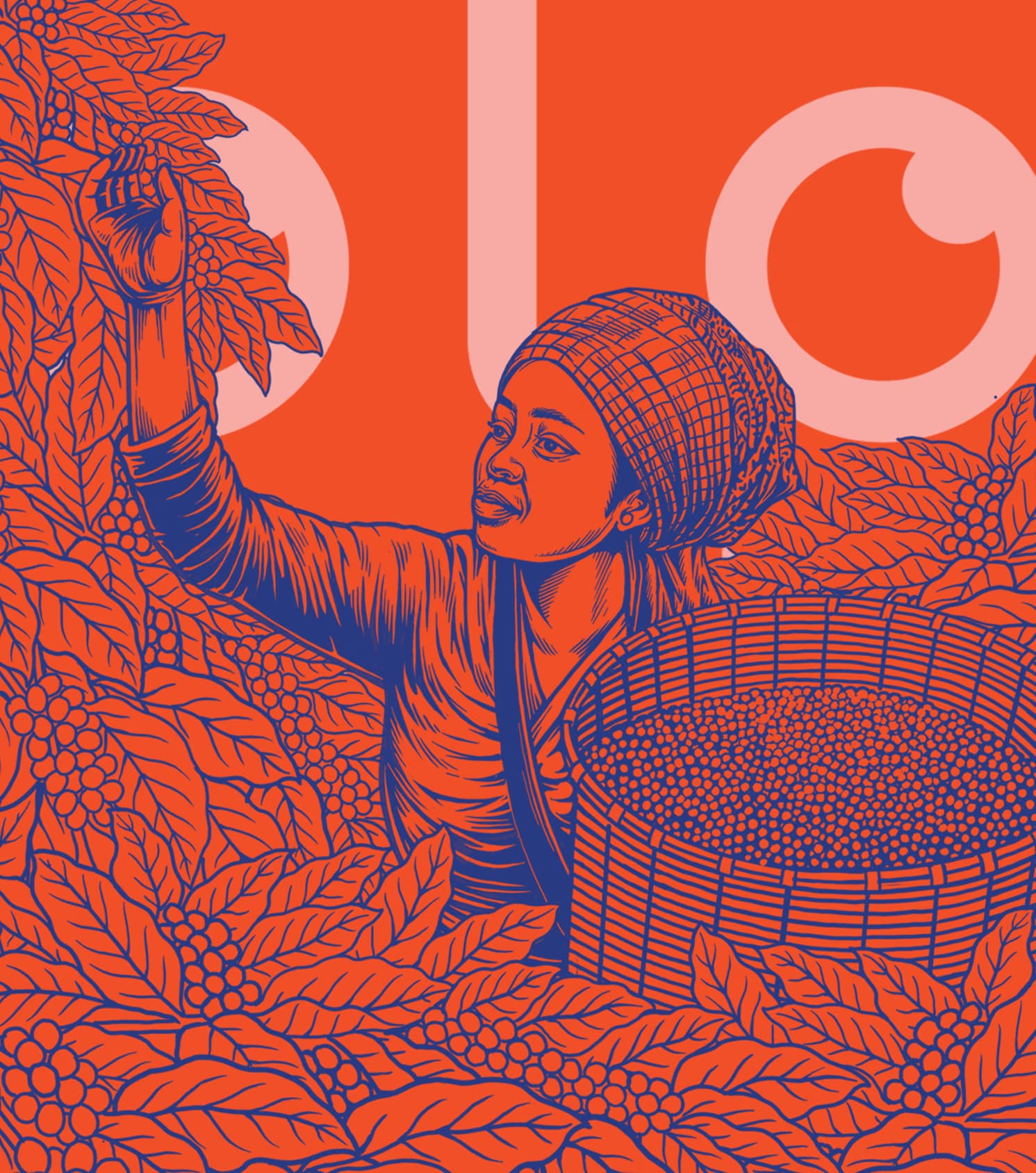
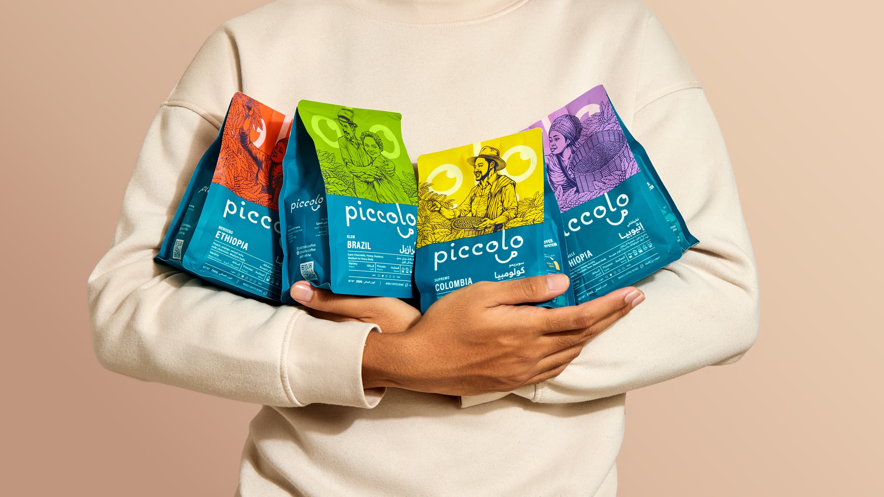
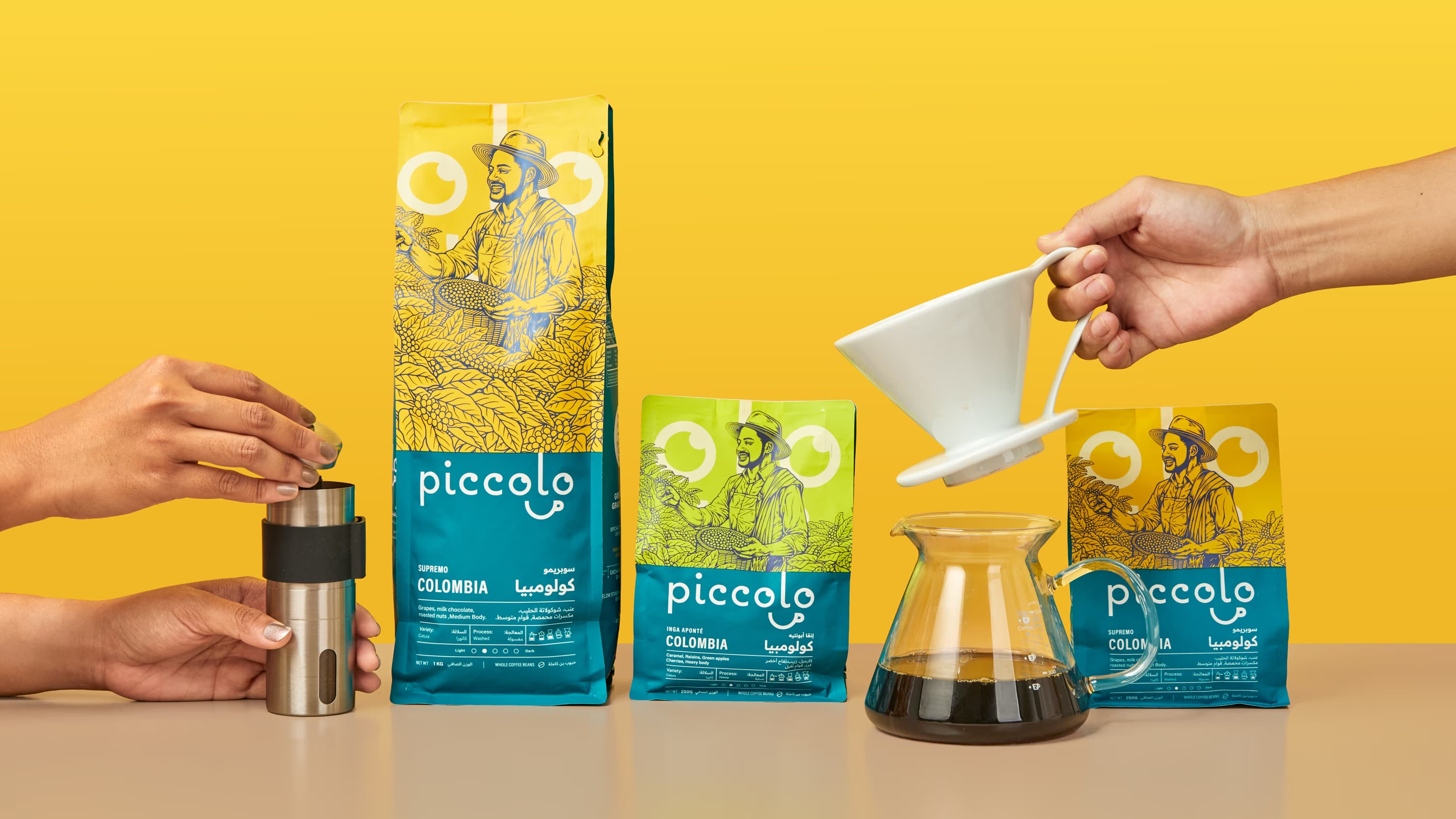
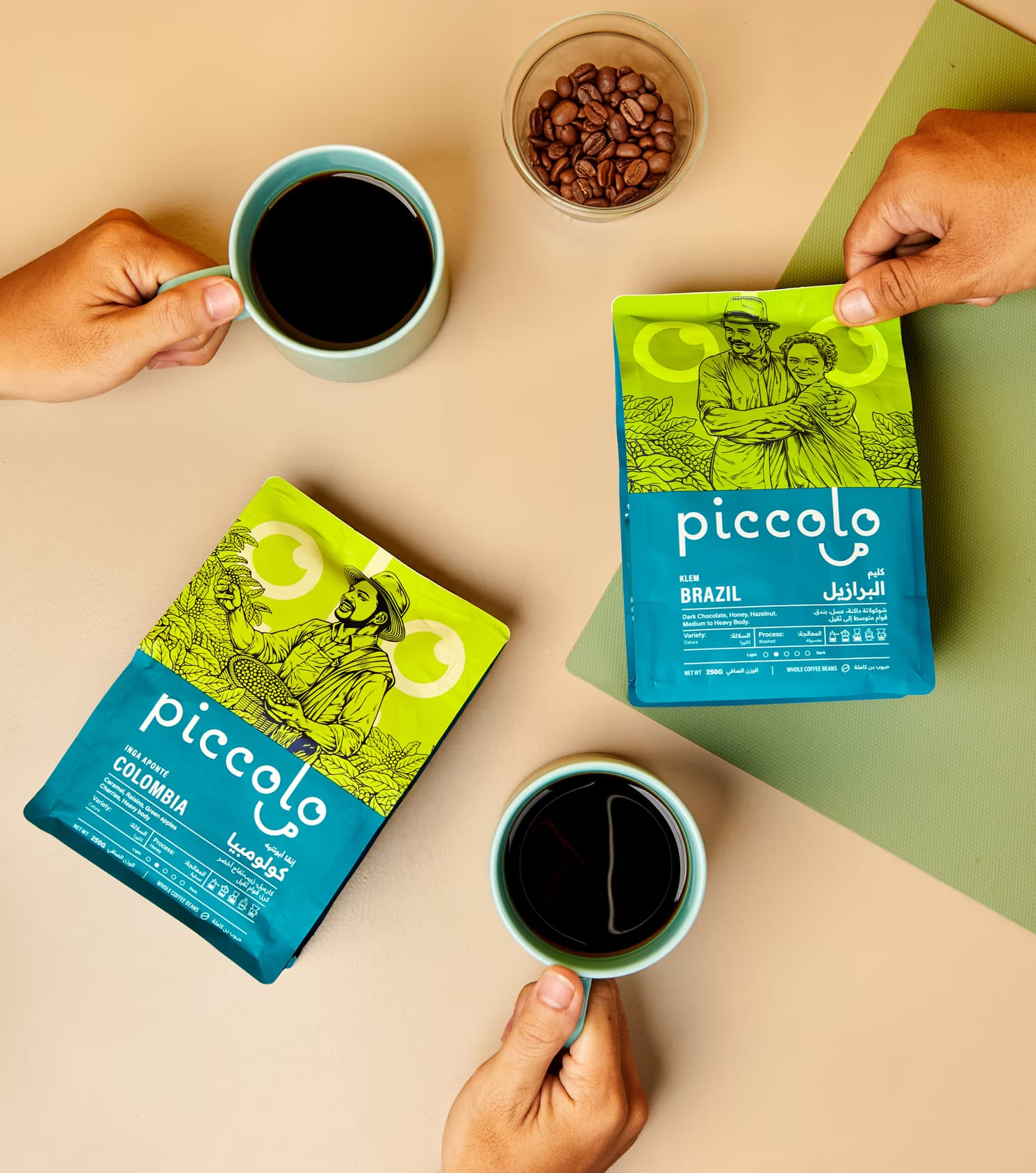
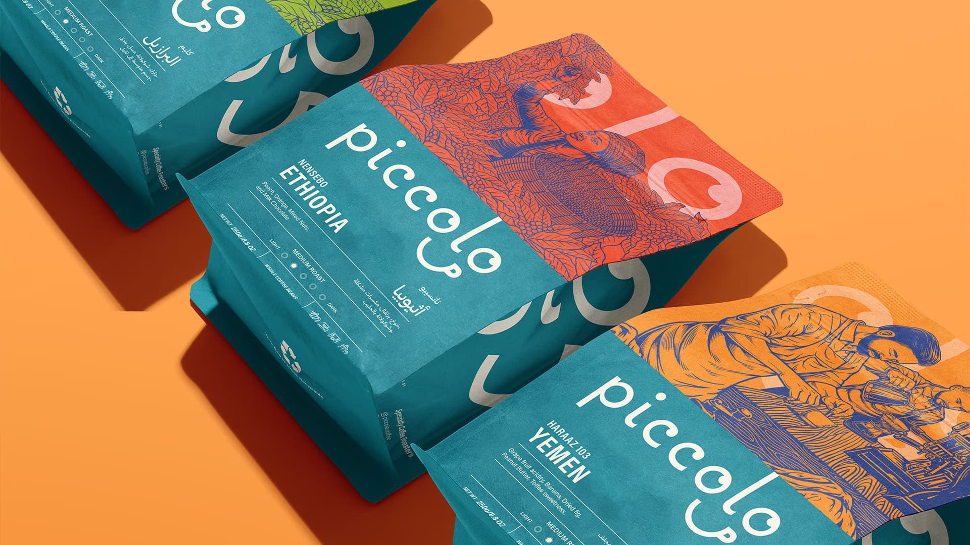
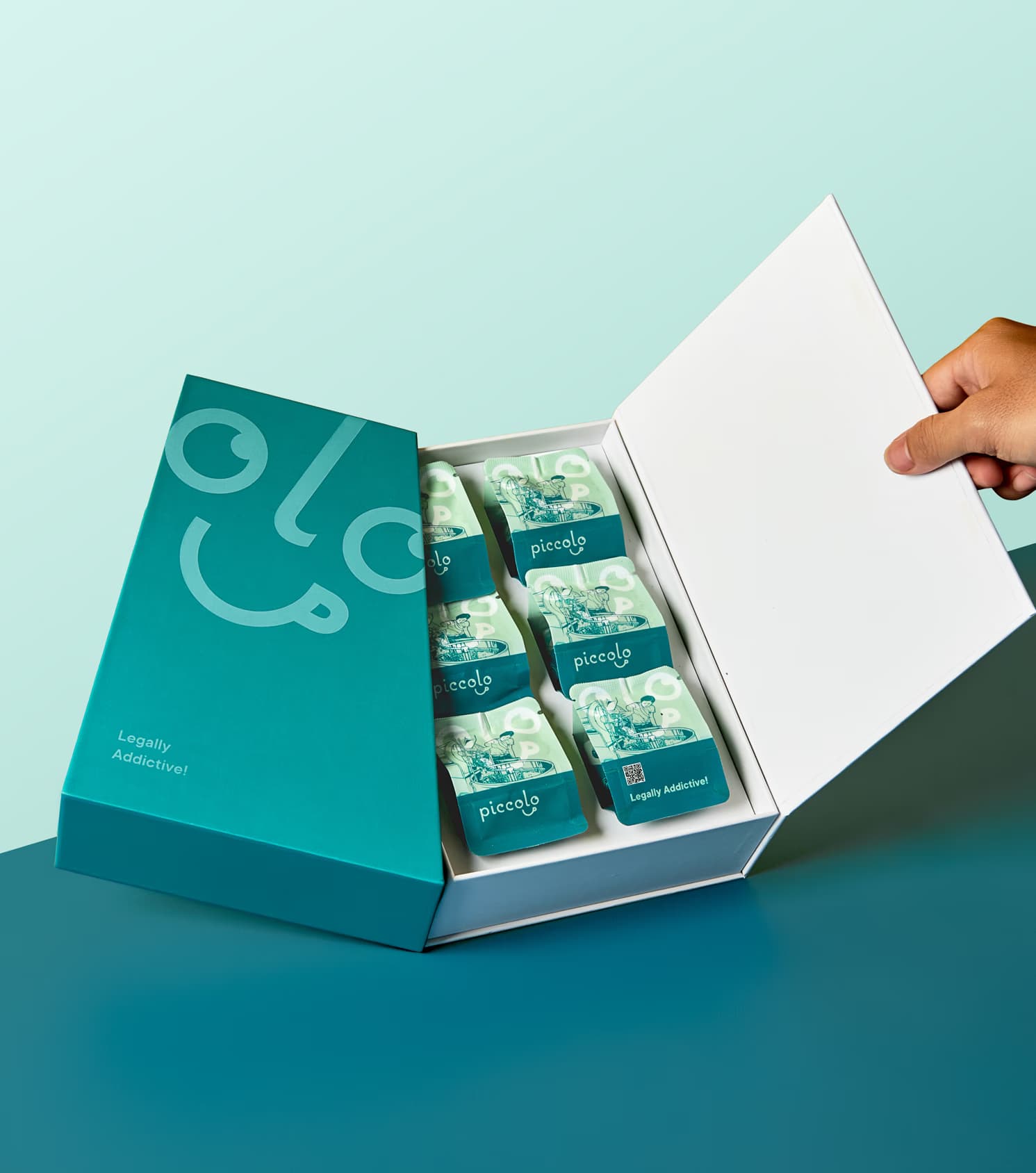
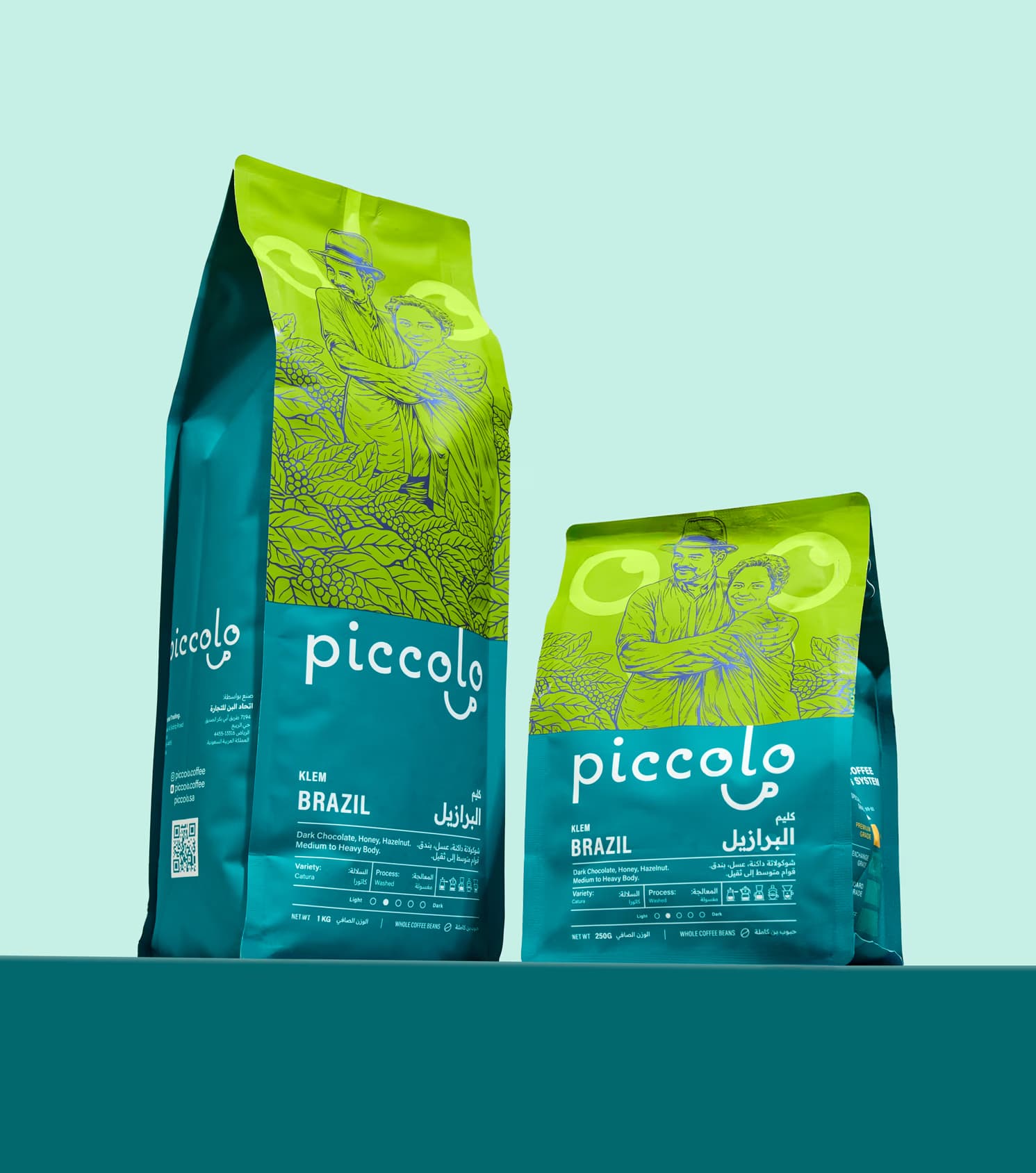
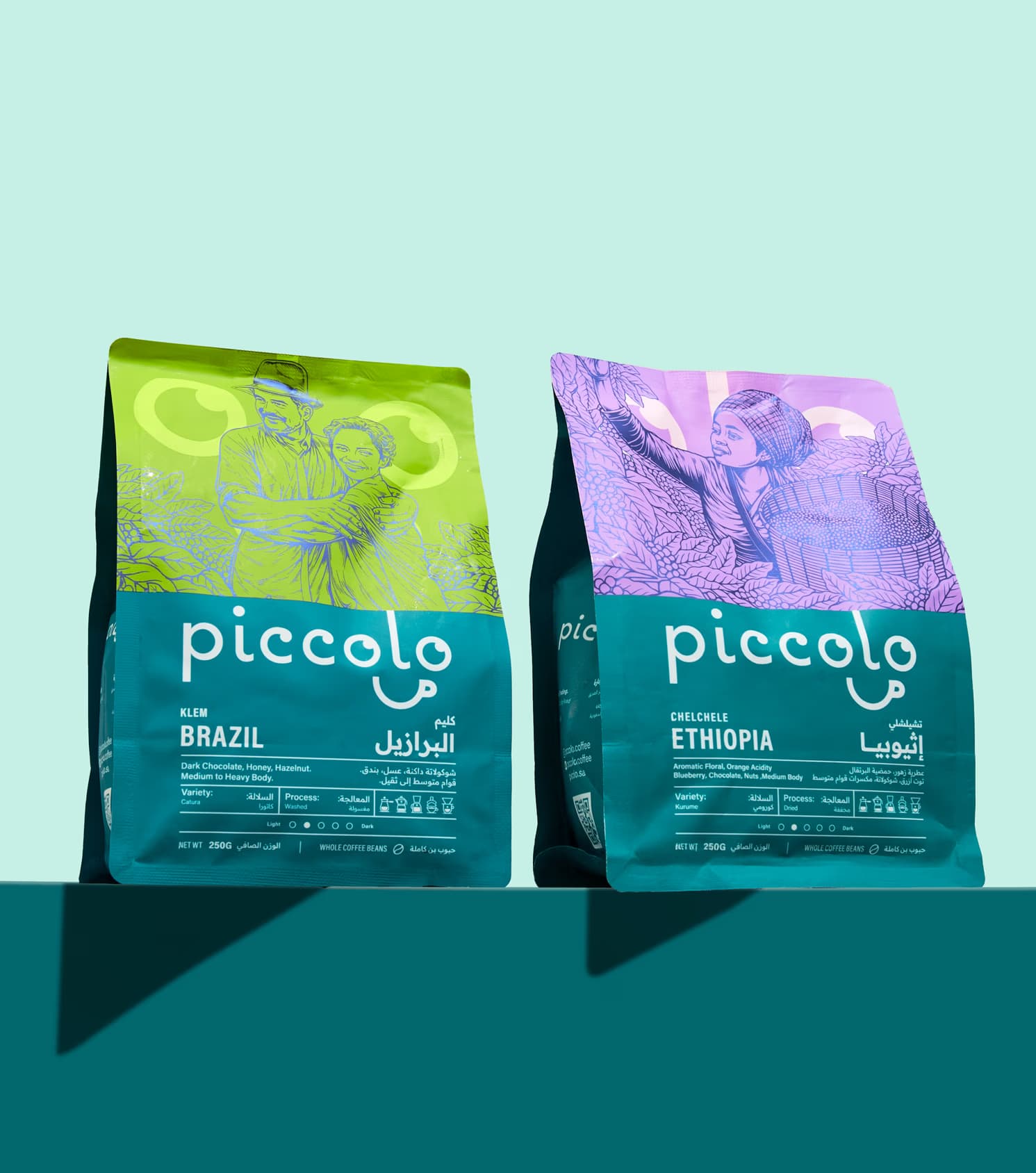
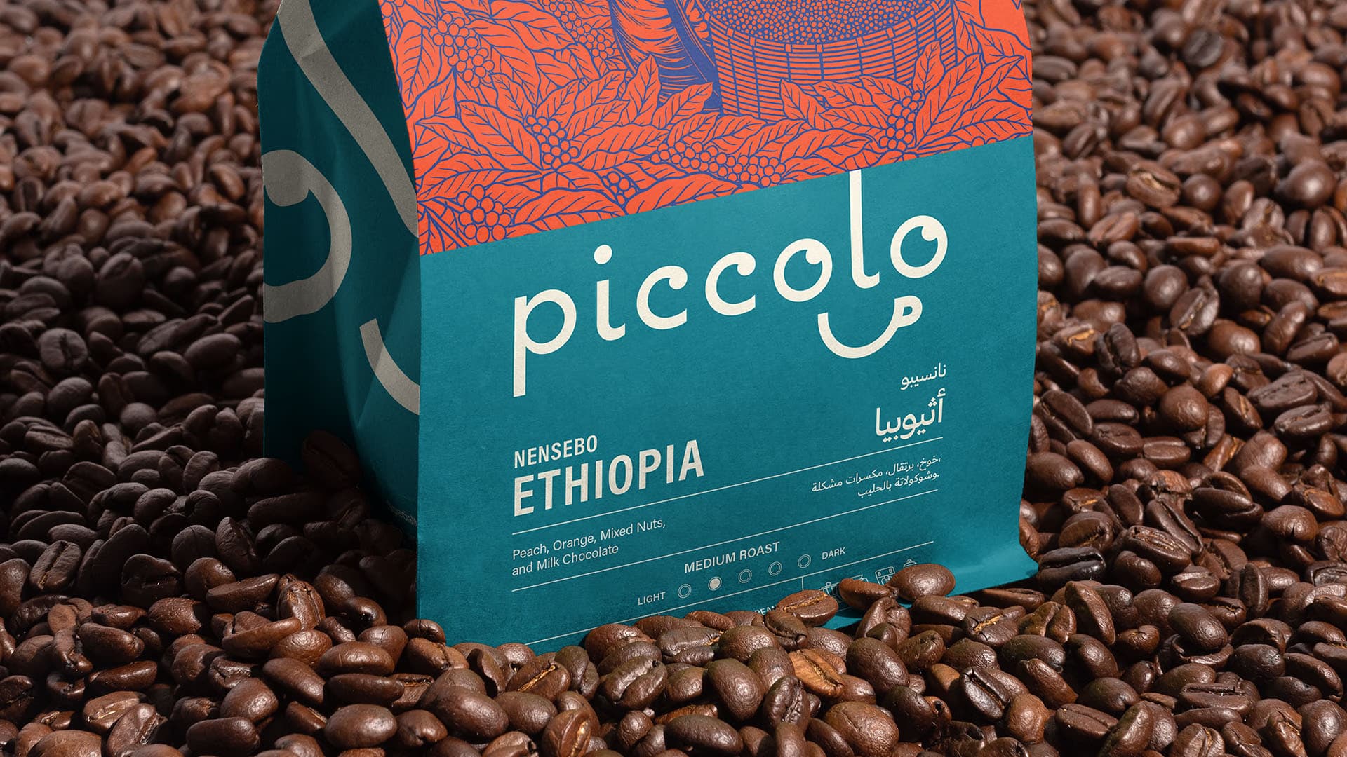
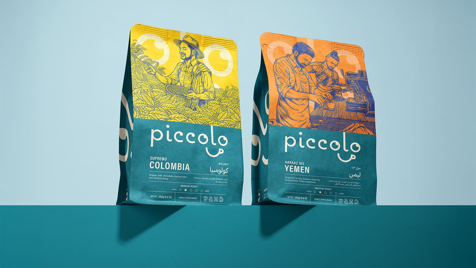
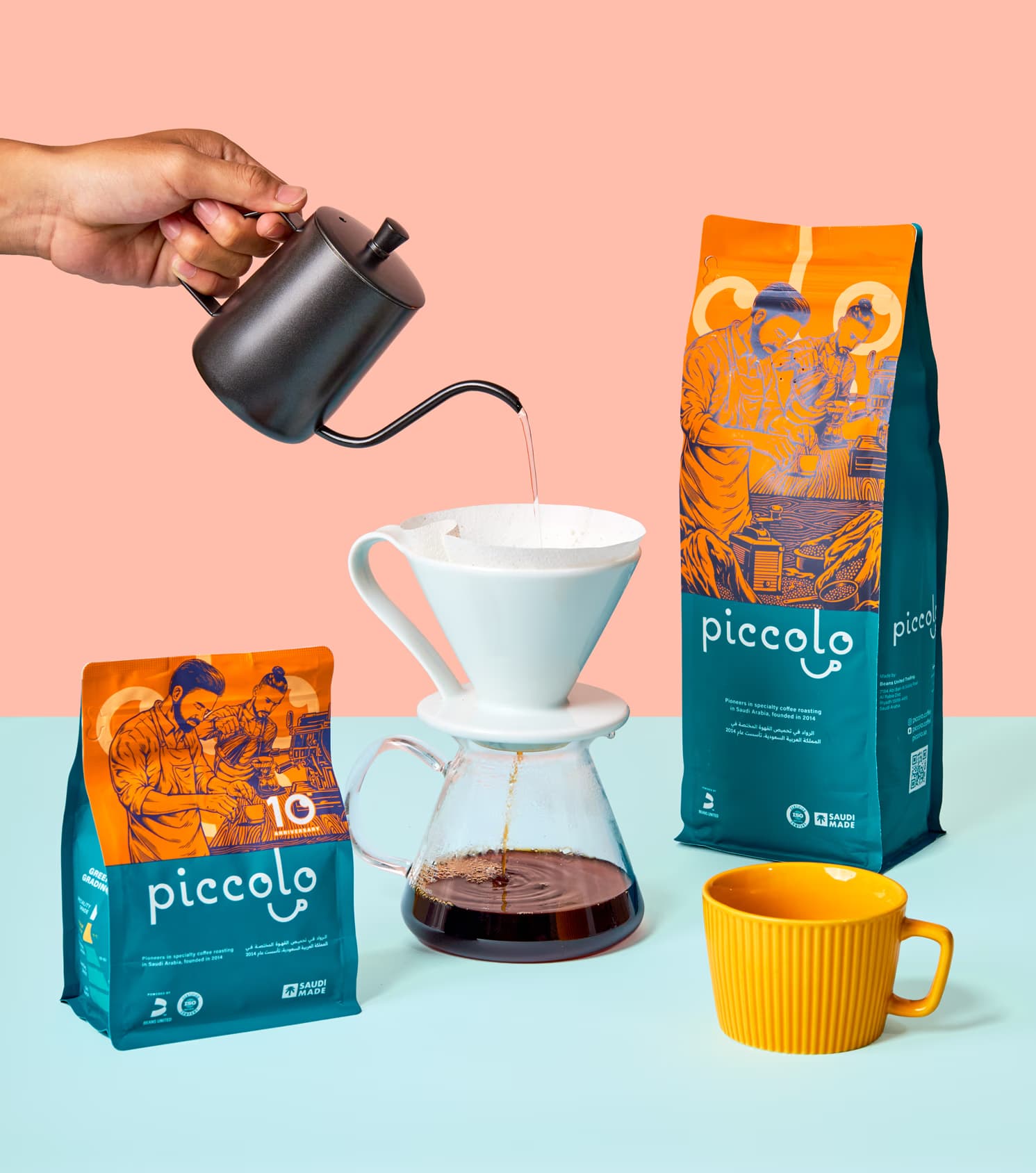
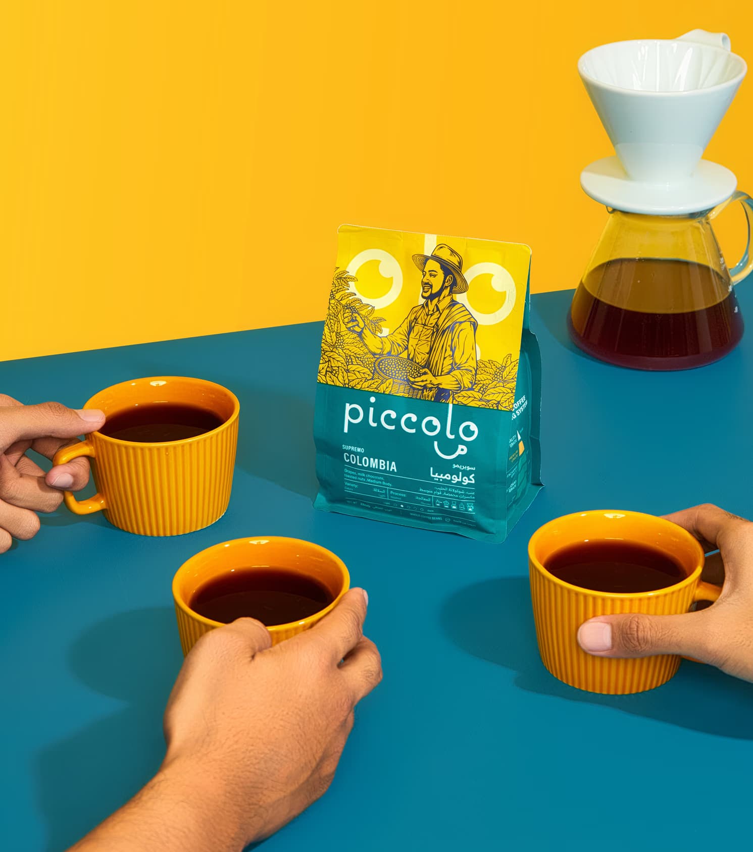
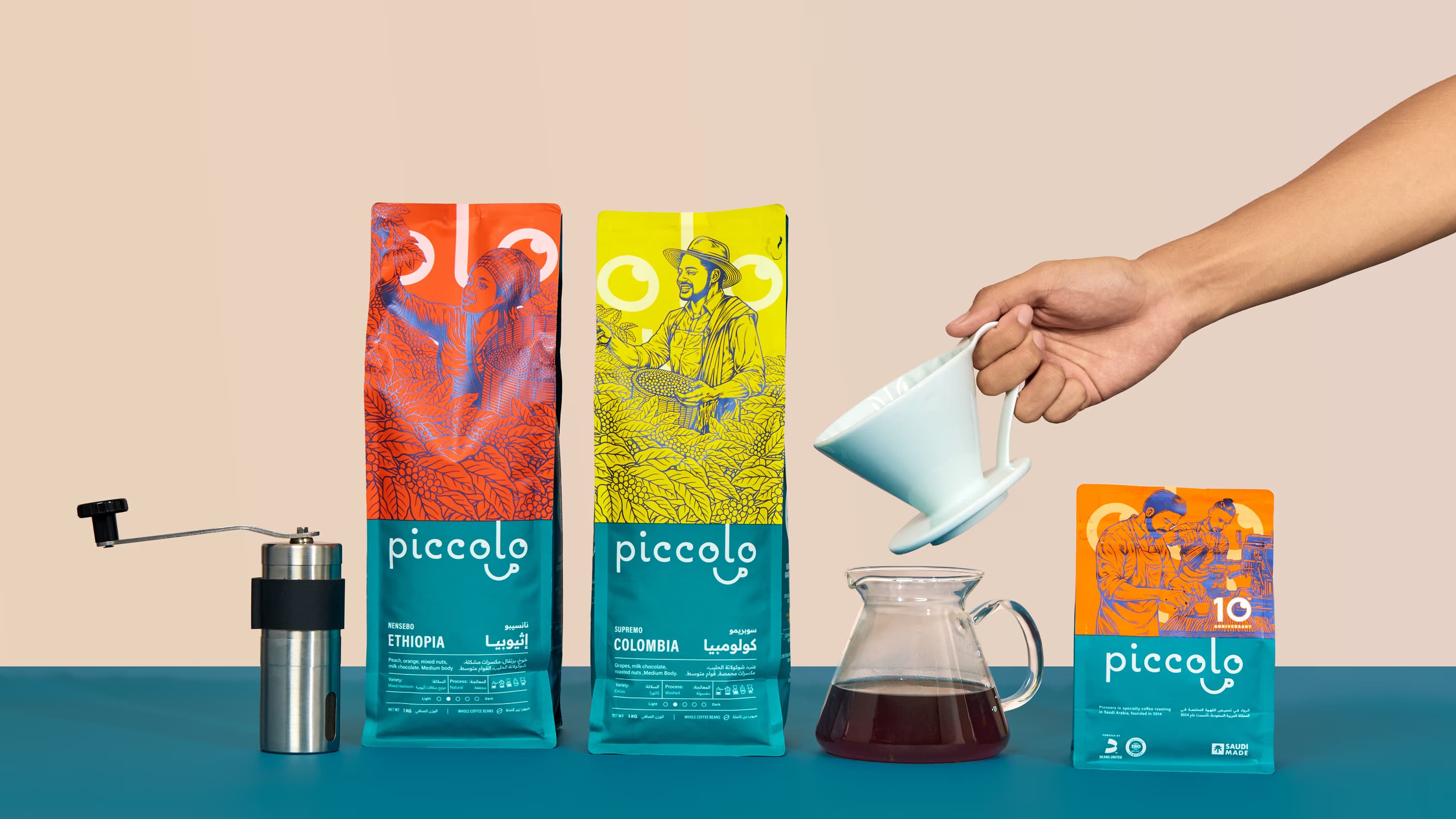
A deep blue became the foundation of the range, chosen for its sense of trust, depth, and restraint. Against it, a series of vibrant supporting colours was introduced to differentiate origins such as Colombia, Yemen, Brazil, and Ethiopia. This created stronger variant recognition while moving Piccolo away from the safer, more predictable palette conventions often seen in the category.
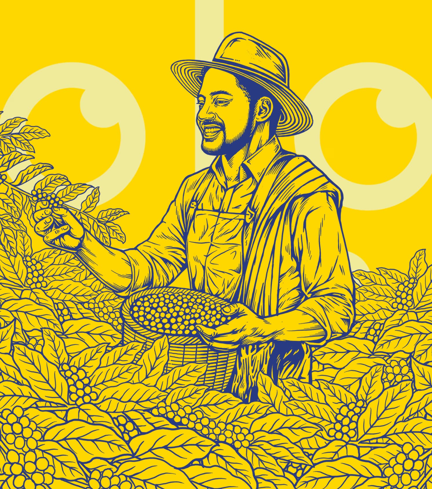
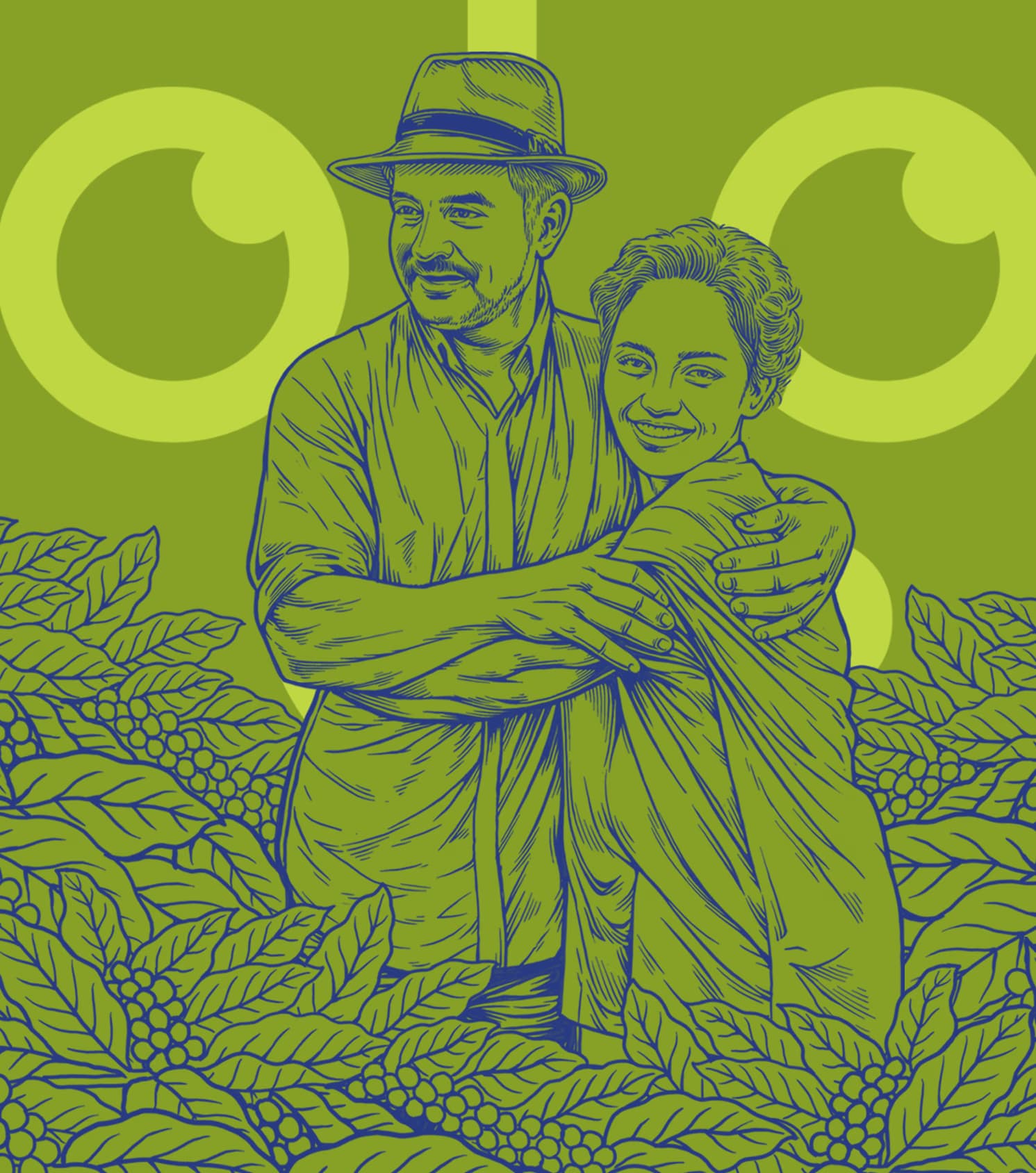
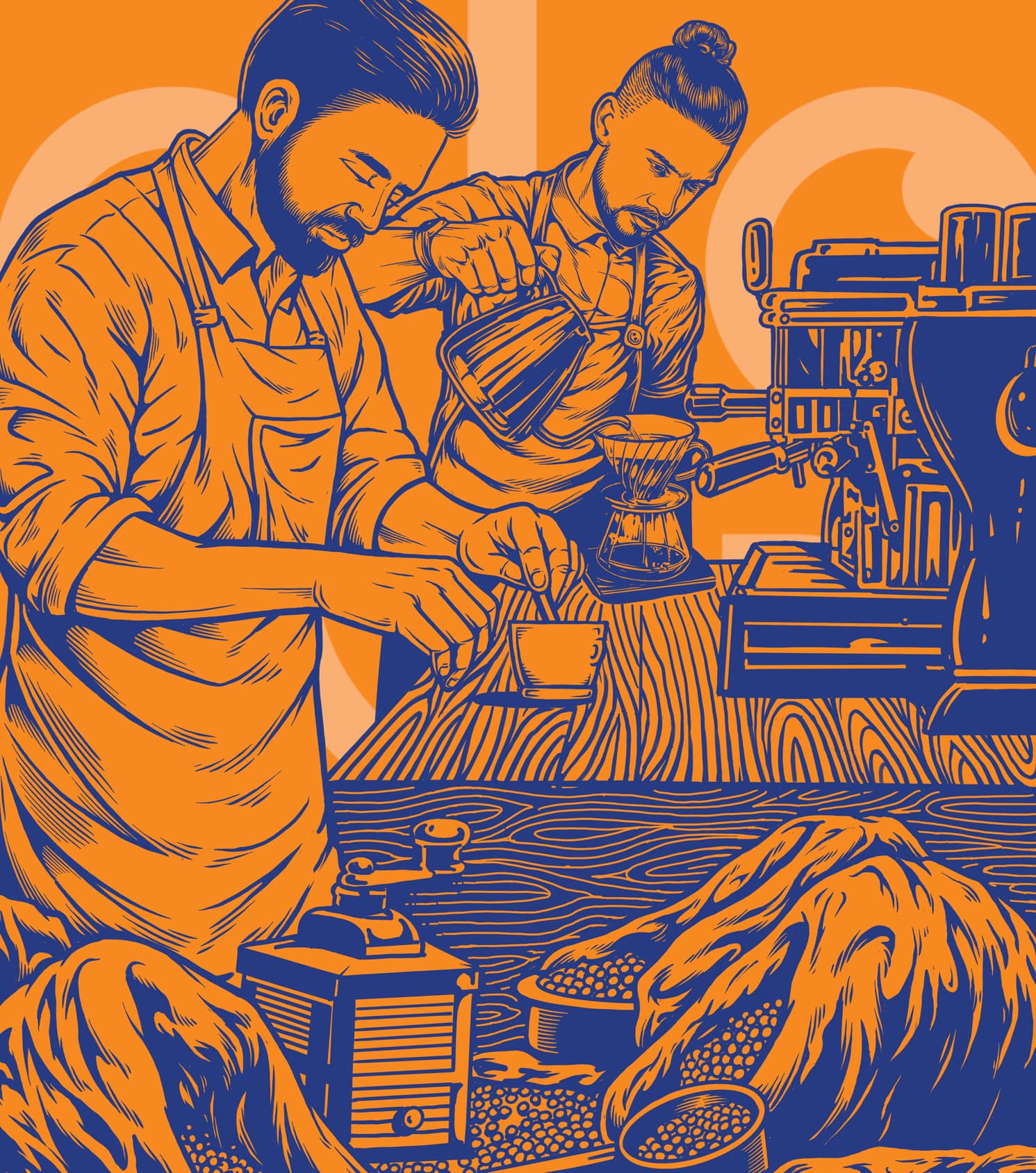
Illustration became central to the system. Rather than relying on standard origin markers or decorative craft tropes, the packs were built around hand drawn visuals with strong line work and woodcut inspired character. These scenes brought the journey behind the coffee to the forefront, from harvesting and preparation to brewing and serving, giving the packaging a narrative quality that felt more human, more immersive, and more ownable to the brand.
To support a broader audience and a more grounded market presence, the packaging was structured in both English and Arabic. Clean contemporary typography was introduced to bring clarity and control, creating a deliberate contrast with the expressive illustration style and helping the system feel current, legible, and commercially resolved.
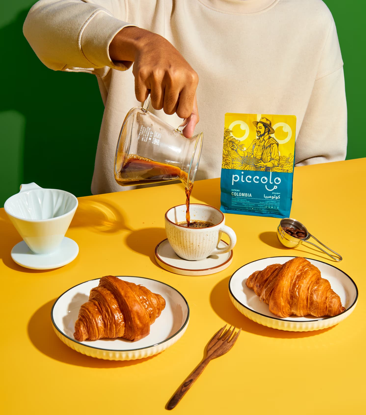
The outcome was a packaging system that gave Piccolo more than distinction by origin. It gave the brand a clearer point of view, a stronger shelf identity, and a more compelling way to express the craft, culture, and human story behind every cup.
Client
Piccolo Coffee Roasters
Industry
Food & Drink
Services
Packaging Design Art Direction
Team
Rahmat Kurniawan


