Coffee World
Rebranding a heritage coffee roastery with a more modern identity designed to strengthen relevance, expand retail appeal, and connect more clearly with a new generation of consumers.


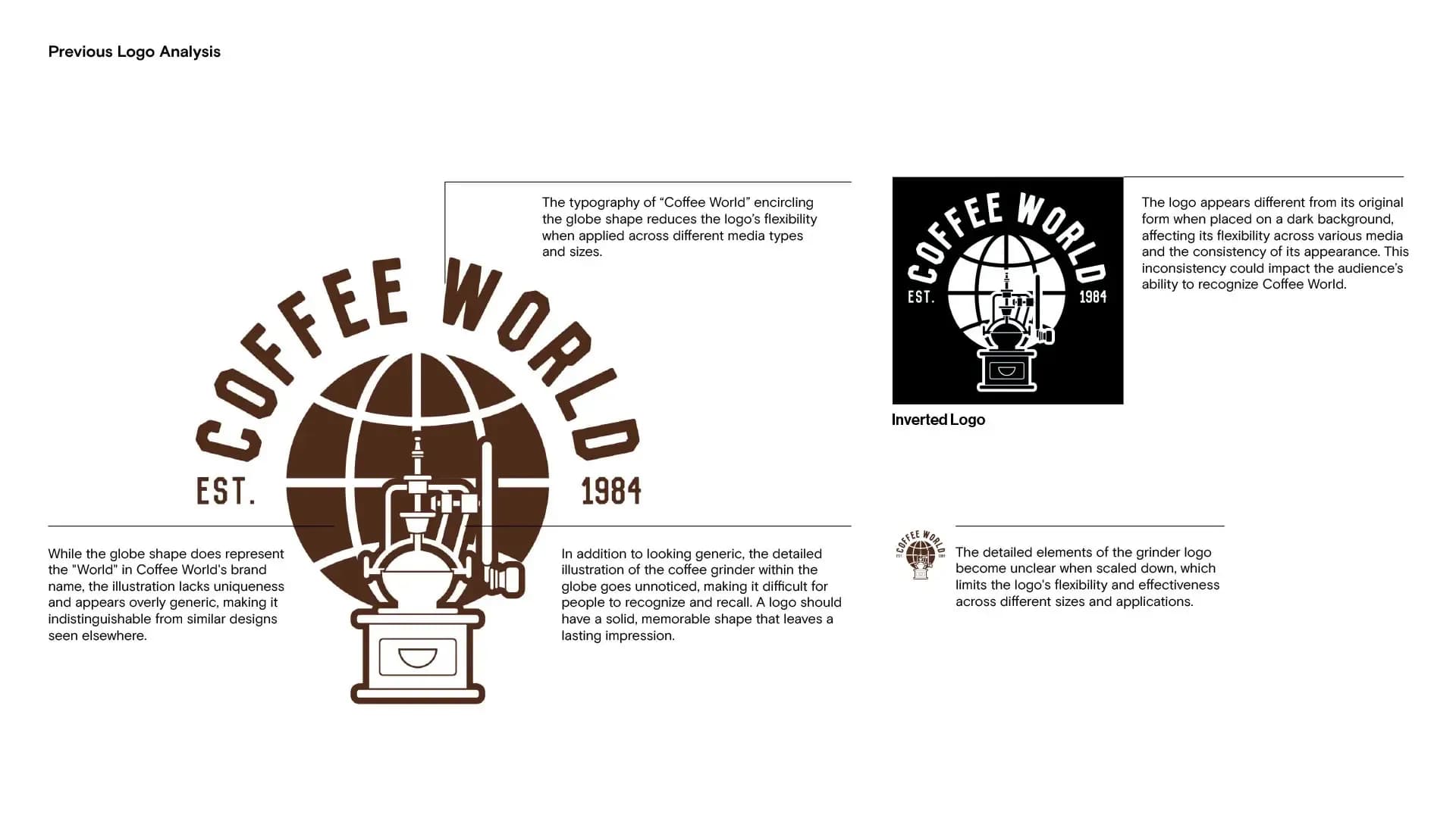
"The previous logo carried heritage, but lacked the clarity, distinctiveness, and flexibility needed to perform consistently across contemporary brand touchpoints."


Overview
Coffee World is a heritage coffee roastery founded in 1984 as the first roaster in Cambridge. Over decades, the business earned its reputation through national supply partnerships, wholesale operations, and deep expertise in coffee. But in a retail landscape shaped by new behaviours, new expectations, and younger consumers, legacy alone was no longer enough. The brand needed an identity that could protect its heritage while making Coffee World feel more visible, more relevant, and more compelling in a contemporary market.
Challenge
Coffee World was respected in the B2B space, but that credibility was not carrying through clearly enough to newer retail audiences, particularly Gen Z and Millennials. The brand had history, capability, and substance, yet its identity was not working hard enough to translate that value to the next generation.
The challenge was not to make Coffee World look newer for the sake of appearance. It was to sharpen how the brand was understood, so that its heritage could become an advantage rather than a distance. The identity needed to feel current, confident, and adaptable across digital and physical touchpoints, while preserving the trust and character the business had built over time.
Solution
Widarto Impact rebranded Coffee World through an identity system designed to make its legacy feel sharper, more contemporary, and more commercially relevant.
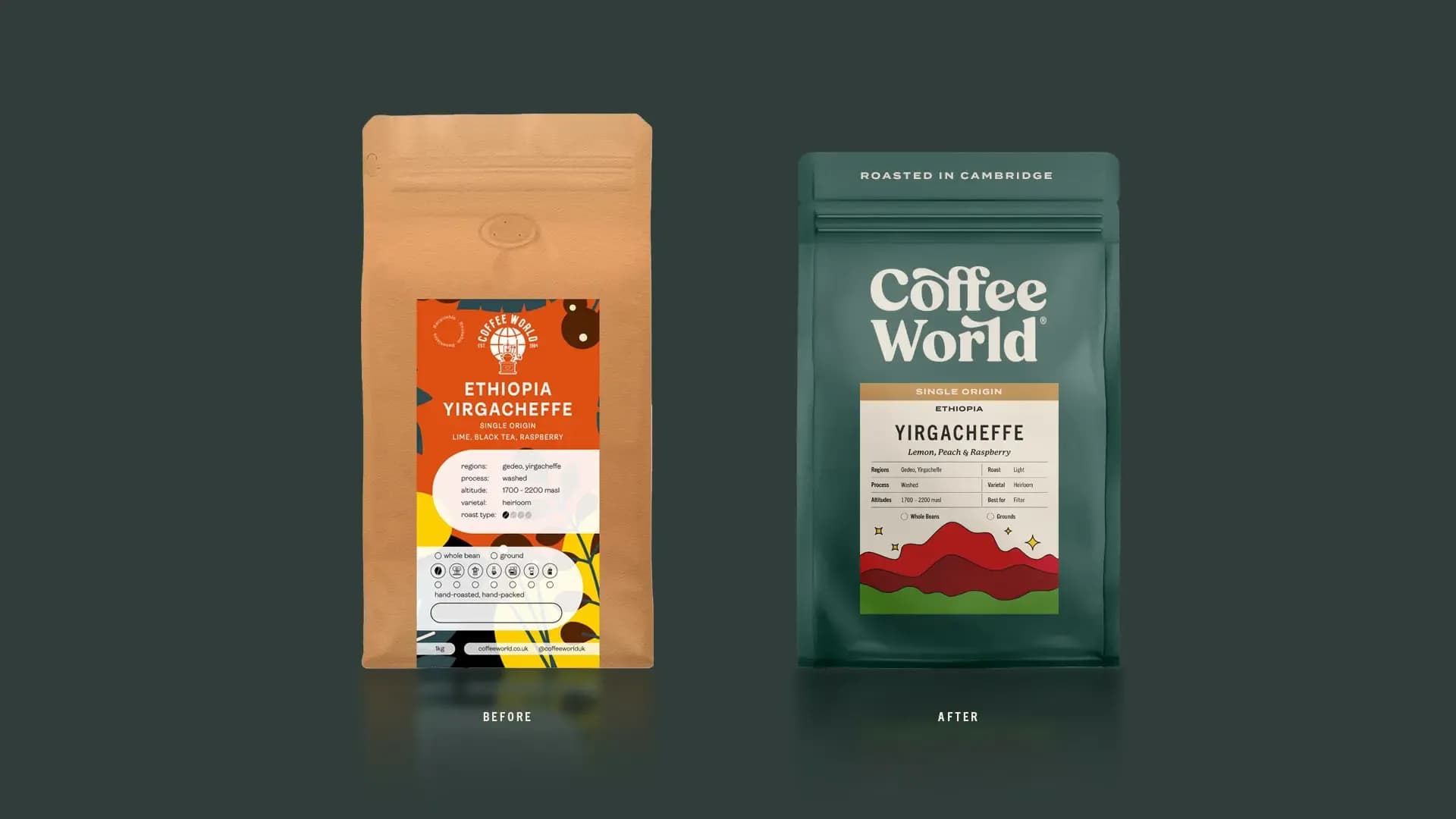
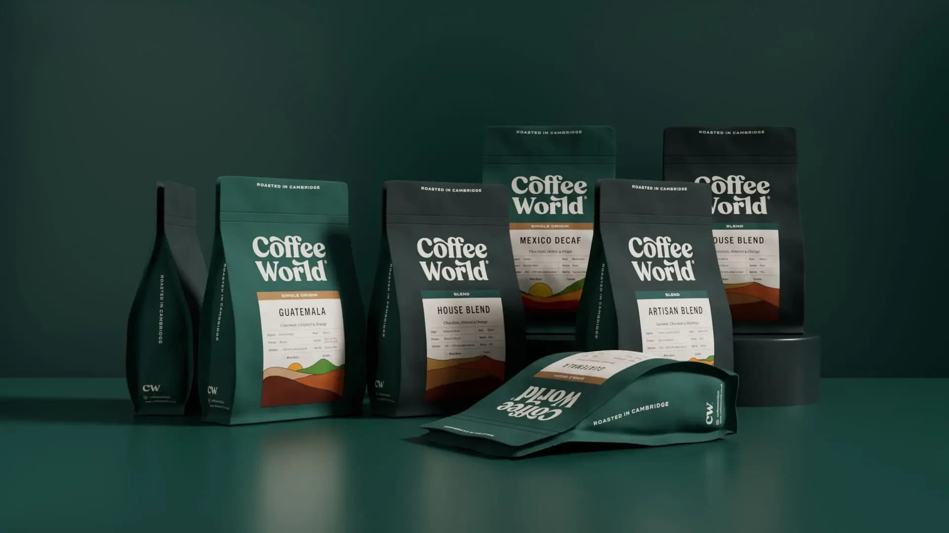
The logo was refined into a bolder serif expression with subtle curved characteristics, giving the brand a stronger presence while retaining its sense of heritage. A simplified CW signature was also introduced to improve recognition and usability across smaller digital applications.
A deep green was established as the primary brand colour to reflect Coffee World’s grounded roots as a traditional roaster, supported by a broader palette that brought greater flexibility across packaging and communications. This was paired with a typographic system combining Trade Gothic Next LT Pro, Termina, and P22 Mackinac Pro to create a clearer balance between modern clarity and heritage character.
The packaging extended the identity through custom mountain illustrations used to distinguish blends and single origin variants. Rather than describing origin literally, the illustrations were developed to evoke craftsmanship, richness, and the artisanal nature of the coffee itself.
What took shape was an identity with greater clarity, stronger recognition, and a more assured market presence. One that honours Coffee World’s heritage while equipping the brand to engage a new generation with more confidence and relevance.
Client
Coffee World
Industry
Food & Drink
Services
Rebranding Brand Identity Beverage


